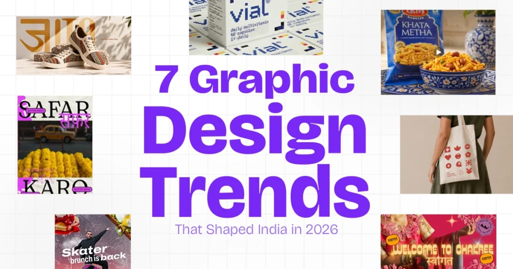
Graphic Design Trends 2026 reflect how India’s creative industry is balancing cultural identity, technological innovation and changing visual preferences.
From heritage-inspired branding and expressive typography to AI-assisted creativity, explore seven visual trends that defined India’s graphic design landscape in 2026.
What You Will Learn
- Seven graphic design trends that stood out in 2026.
- How Indian brands and studios explored these visual directions.
- The growing influence of regional typography and cultural identity.
- What designers can take away from the year’s creative developments.
Introduction
As 2026 approaches its final two months, it’s a good time to look back at the visual ideas, creative approaches and design movements that shaped the year.
The graphic design landscape has continued to evolve, influenced by changing consumer preferences, new creative technologies and a growing appreciation for cultural identity. From expressive typography and heritage-inspired branding to tactile textures and AI-assisted experimentation, designers have explored different ways to make visual communication more distinctive.
In India, this evolution has been particularly interesting. Traditional visual references have found their way into contemporary brand identities, regional typography has gained renewed attention, and packaging design has become increasingly important in a digital-first marketplace.
Meanwhile, AI has changed how creative professionals explore and develop visual concepts. But alongside this technological shift, there’s also been a renewed appreciation for human creativity, craftsmanship and imperfect design.
So, what really stood out in 2026?
We’ve looked at design forecasts, Indian branding projects and creative work from studios to bring together seven graphic design trends that defined the year. More importantly, we’ll explore real examples and what designers can learn from them.
Let’s revisit the visual ideas that made 2026 an interesting year for graphic design.
7 Graphic Design Trends That Shaped India in 2026 (With Real Examples)
1. Indian Heritage Meets Modern Maximalism
Minimalism has its place, but not every brand needs to communicate through muted colours, generous whitespace and restrained typography. One of the interesting creative directions of 2026 has been the reinterpretation of cultural heritage through bold, contemporary visual identities.
Think of traditional textile patterns, regional architecture, folk illustrations, decorative borders and festive colour palettes. These elements offer designers a rich source of inspiration for creating identities that feel distinctly Indian while remaining contemporary. Instead of reproducing traditional motifs exactly as they are, designers can reinterpret them through modern typography, simplified shapes, bold compositions and structured layouts.
Real example: Kaleva by Clunk Design
Kaleva, a heritage namkeen brand rooted in Rajasthan, provides a useful example of this approach. In its 2026 identity project, Clunk Design drew inspiration from carved arches, folk motifs, festive textiles, brass serveware and the warmth of traditional Rajasthani hospitality.
The packaging combines these cultural references with bold colour-coded variants and refined typography, creating a contemporary shelf presence without abandoning the brand’s regional character.
What designers can learn: Cultural references become more effective when they have a genuine connection to the brand. Instead of adding decorative Indian motifs simply because a product is sold in India, identify the place, craft, tradition or story that gives the identity meaning.
Explore: Kaleva — Clunk Design
2. Expressive Typography and Vernacular Design
Typography is more than a way to display words. It can establish personality, communicate cultural identity and make a campaign recognisable before someone has even read the supporting copy.
In 2026, expressive lettering remained an important creative direction. Oversized headlines, custom letterforms, unusual font combinations and playful distortions gave designs more energy than conventional type hierarchies.
For Indian designers, vernacular typography offers another opportunity. Devanagari, Bengali, Tamil, Malayalam, Urdu and other regional scripts can bring a distinctive visual voice to communication when treated as integral design elements rather than last-minute translations.
If you’re exploring typefaces for Indian-language projects, take a look at our collection of 55 Best Hindi Fonts for Creatives.
Consider a Hindi music poster, a regional food campaign or a festival identity. The script itself can contribute to the atmosphere, rhythm and cultural context of the work.
What designers can learn: Experiment with custom lettering, display typefaces and regional scripts, but choose forms that suit the message. Readability, language accuracy and typographic hierarchy still matter.
A strong multilingual typography project can also demonstrate both visual craft and an understanding of diverse audiences in your portfolio.
Explore: Juta — The Nimboo Studio
3. Imperfect Graphics, Collage and Human Expression
Perfectly aligned layouts, polished mock-ups and carefully controlled compositions remain valuable. Yet another creative direction that gained attention in 2026 embraces the opposite: visible texture, rough edges, handwritten notes, cut-and-paste compositions and deliberately imperfect details.
Canva’s 2026 report describes this movement as Imperfect by Design. It reports a 90% year-over-year increase in searches for DIY and scrapbook-style elements on its platform.
These visuals can feel personal because they resemble something made, collected or assembled by a human rather than produced from a perfectly uniform template.
Imagine a poster combining scanned paper textures, handwritten annotations, photographic cut-outs and oversized type. The result may be less polished in a conventional sense, but it can have a stronger sense of personality.
This direction works particularly well for independent music, cultural events, editorial design and social campaigns that benefit from an experimental aesthetic.
For more visual references, explore our guide to poster design trends of 2025–2026, featuring mixed-media compositions, scrapbook aesthetics and experimental layouts.
What designers can learn: Imperfection should be intentional. A rough texture or uneven composition needs to support the idea, not become a substitute for it. The goal isn’t to make every design look unfinished. It’s to recognise that personality can sometimes be more valuable than visual perfection.
Explore: Canva Design Trends 2026
4. Tactile Textures and Sensory 3D
As more brand communication happens on screens, designers are finding creative ways to make digital visuals feel tangible.
Think of inflated lettering, glossy liquid surfaces, soft-looking materials, realistic paper, embossed typography and product renders with convincing reflections. These techniques introduce depth and materiality into an otherwise flat image.
Adobe’s 2026 creative forecast identifies tactile and sensory experiences as a notable direction, alongside exaggerated, playful letterforms.
For Indian brands, these techniques can be useful in beauty campaigns, consumer electronics, food advertising, product launches and premium packaging presentations. A realistic surface or carefully rendered material can help establish a product’s character before the audience encounters it physically.
But the technique needs to fit the product. A glossy 3D treatment might suit a futuristic technology launch, while a handmade paper texture could be more appropriate for a craft-led brand.
What designers can learn: Start with the message and material. Ask what the audience should feel when they see the image, then select the appropriate lighting, texture and depth.
Three-dimensional effects are most effective when they improve the concept rather than simply make a composition look more complicated.
Explore: Adobe’s Top Graphic Design Trends for 2026
5. Packaging That Works on the Shelf and on a Screen
Packaging design today needs to work across both physical and digital environments. A product may sit on a retail shelf, appear on an e-commerce marketplace, feature in a social media campaign or be viewed as a small thumbnail on a mobile screen. In each setting, its packaging needs to communicate the brand clearly and quickly.
This makes visual hierarchy, product recognition and brand consistency essential. The product name should be easy to identify, important information must remain legible, and colour variations should help customers distinguish between different products. Even when the packaging appears in different sizes or formats, the overall identity should remain recognisable.
A strong packaging system also contributes to a memorable brand experience. Every choice, from typography and colour to layout and imagery, influences how customers perceive a product. For more ideas on creating a recognisable and consistent brand, explore our guide to 10 branding tips to elevate your business.
Real example: vial by Presentable
The vial project by Gurugram-based design studio Presentable explores a different way to approach multivitamin packaging.
The conceptual identity uses a modular grid inspired by the logic of Tetris and the structured compositions of Mondrian. Geometric blocks represent individual nutrients, while colour and restrained typography help organise the system. Integrated checkboxes introduce a practical interaction by allowing users to track daily intake.
Rather than relying on loud claims or conventional clinical imagery, the concept communicates consistency and routine through its visual structure.
What designers can learn: Good packaging is not only about looking attractive. It also helps people recognise, understand and use a product. A repeatable design system can make an entire product range feel connected while allowing individual variants to stand apart.
Explore: vial — Packaging of the World
6. AI-Assisted Design With a Human Point of View
AI has been one of the biggest conversations in the creative industry during 2026. Tools that generate images, suggest compositions and transform references have made it easier for designers to explore ideas and experiment with unfamiliar visual styles.
If you want to explore the tools behind this creative shift, check out our guide to 20 best AI tools in 2026, covering platforms for image generation, video creation and creative workflows.
But the important development isn’t simply that designers can generate more images. It’s how they decide which images deserve to become part of a final design.
A useful workflow might begin with several AI-generated visual concepts, followed by careful selection, art direction, typography, colour correction and refinement in a design application.
In India, AI also presents opportunities to explore campaign variations, culturally relevant visual references and different creative directions for diverse audiences.
However, generated imagery can misrepresent regional details, clothing, architecture or cultural practices if the output isn’t reviewed. Designers also need to consider image rights, tool licensing and usage restrictions.
What designers can learn: Treat AI as a creative assistant, not an art director. Develop your visual judgement, learn to write useful prompts and understand composition, lighting, typography and brand systems well enough to improve the output.
When generative tools become widely available, a designer’s ability to select, edit and give meaning to an image becomes even more important.
Explore: Dhathri AI Campaign | Reliance Digital Campaign | Adobe India Go Big
7. Modular Brand Identities and Functional Design Systems
A brand identity is no longer limited to a logo, a colour palette and a typeface. Modern brands need visual systems that can adapt across websites, social media, packaging, publications, events and physical spaces.
This is where modular brand identities come into play.
Instead of designing every application independently, designers create a flexible visual language using typography, colours, shapes, grids and graphic elements. These components can be rearranged or adapted for different platforms and formats while maintaining a consistent brand personality. Building such a system requires more than a good logo; it also involves choosing the right tools and establishing clear visual guidelines. Explore our guide to 5 essential design tools for branding projects to discover tools that can help create and maintain consistent brand identities.
The result is an identity that feels connected across different platforms without making every application look identical.
Real example: 1000 Days Collective by Turntable
Mumbai-based design studio Turntable developed the visual identity for the 1000 Days Collective, an initiative focused on maternal and child nutrition.
The project required a visual language that could communicate the different stages of a child’s first 1,000 days while remaining accessible and consistent across multiple applications.
The studio developed a distinctive graphic system featuring Devanagari numerals, a terracotta-inspired colour palette and a collection of icons representing different stages of the 1,000-day journey. These individual elements could work independently or come together to create larger compositions.
The identity was designed to extend beyond a single logo, appearing across event screens, publications, installations and other communication materials. Its flexible structure also allows the system to evolve for future editions, languages and themes.
What makes this project interesting is how the design system connects visual consistency with a practical communication purpose. Rather than relying on a collection of unrelated graphics, Turntable created a visual language that can grow with the initiative.
What designers can learn: Think beyond individual design assets. Build a system with reusable elements, clear visual rules and enough flexibility to accommodate different formats and audiences.
A well-designed modular identity doesn’t just make a brand look consistent. It makes the brand easier to recognise, communicate and grow.
Explore the project: 1000 Days Collective — Turntable
What These Trends Mean for Indian Designers
These seven directions don’t suggest that every brand should become colourful, textured or AI-driven. Different businesses have different audiences, objectives and visual requirements.
A heritage food brand may benefit from regional references and expressive packaging. A digital product might need a modular identity and strong interface typography. An entertainment campaign could use collage and dramatic visual effects, while a premium brand may achieve more through restraint.
The real skill is knowing which direction serves the brief.
If you’re developing your portfolio, consider creating projects that demonstrate more than an attractive final image. Show the thinking behind your choices, how you developed the visual system and how the design works across different applications.
For designers working with Indian audiences, there’s also an opportunity to build stronger cultural and linguistic awareness. Understanding regional scripts, visual traditions and audience expectations can help you create work that feels relevant rather than generic.
And as AI becomes more accessible, creative judgement, concept development and the ability to build coherent visual identities will remain important differentiators.
Conclusion: What 2026 Taught Us About Graphic Design
Looking back at 2026, one thing becomes clear: graphic design isn’t moving in just one direction.
While AI has expanded the possibilities of visual experimentation, designers have also rediscovered the value of handmade details, cultural references and expressive typography. Brand identities have become more adaptable, packaging has had to work harder across digital and physical spaces, and visual storytelling has continued to evolve.
For Indian designers, the biggest opportunity has been finding new ways to combine local identity with contemporary design thinking.
Not every trend will suit every project, and not every visual direction will remain relevant in the coming years. That’s perfectly fine. Trends are useful sources of inspiration, not rules that every designer must follow.
As we move towards 2027, the real takeaway from this year is simple: technology can expand what designers create, but creative thinking determines why they create it.
And perhaps that’s what makes great design timeless.
Share
More Creative Inspiration


Note: The trends discussed in this article are based on published design reports, creative forecasts and real-world projects. They represent notable creative directions observed in 2026, rather than a complete survey of India’s design industry.