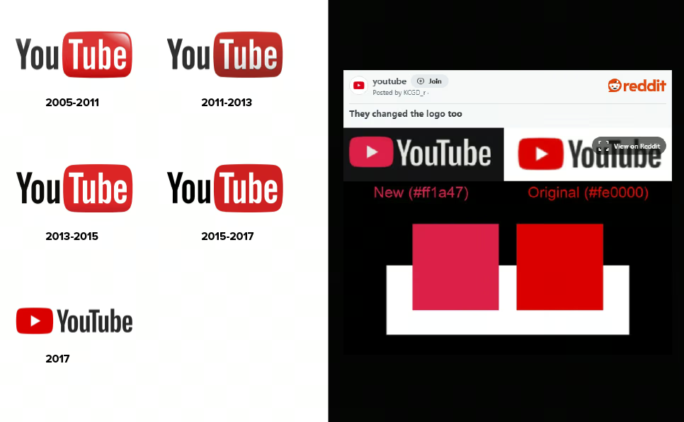
The YouTube logo has changed its color, and many users are only just noticing. The change has been in place since October, and the platform’s logo continues to evolve. Let’s take a look at the YouTube logo design journey, from 2005 to its latest update in 2025.
The Original YouTube Logo (2005-2011)
YouTube’s original logo was introduced in 2005 when the platform first launched. The logo featured the word “You” in black bold text, followed by “Tube” inside a red, TV-shaped bubble. This design played on the nickname for television, “tube,” representing YouTube’s mission to bring the TV-watching experience online. This simple yet bold design became iconic, perfectly representing YouTube’s early experimental nature.
YouTube Logo Update: A Sleeker Look (2011-2017)
In 2011, YouTube refined its logo. The iconic red bubble became sleeker, and the font was updated for a more modern feel. These subtle changes reflected YouTube’s evolution into a global platform with diverse content and creators. The update also symbolized the platform’s growing professionalism as it attracted more creators and viewers alike.
A Major Overhaul in 2017: Focus on Video
The biggest logo change happened in 2017, when YouTube repositioned the red play button to the left of the wordmark, transforming it into a standalone symbol of video content. This redesign reflected YouTube’s shift toward being a video-first platform. The new minimalist font and layout made the logo more mobile-friendly and modern, symbolizing YouTube’s evolution into a multimedia powerhouse.
The Recent Color Update: 2025
In 2025, YouTube updated the color of its logo, making the red hue brighter and more vibrant. This subtle change aligns with current design trends that emphasize bold visuals, especially on mobile devices and in dark mode. While the change may seem minor, it reflects YouTube’s commitment to staying fresh, visually engaging, and up-to-date in the ever-evolving digital landscape.
Conclusion
YouTube’s logo evolution is a testament to how design plays a vital role in a brand’s identity. From the original “TV-tube” symbol to today’s sleek, mobile-friendly logo, each update has been carefully crafted to reflect the platform’s growth and innovation. The recent color tweak shows that even small design updates can help keep a brand modern and relevant.
Looking for more design tips and tools? Subscribe to our blog and stay updated on the latest trends in the design world!