Introduction
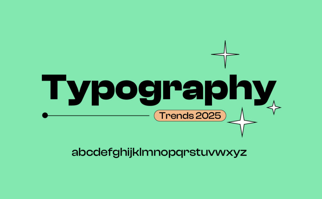
Typography isn’t just about choosing fonts — it’s how you set the tone, voice, and experience of a brand or design. As we move through 2025, typography is evolving in bold new directions. In this post, we explore the key Typography Trends 2025 has brought forward — trends that are not just stylish but essential for effective modern design.
You may also like:
- Typography for Beginners: Your Complete 2025 Design Guide
- Top 10 Free Design Resources Every Designer Should Bookmark
- How to Avoid Common Typography Mistakes
- 25 Poster Design Inspiration Ideas for 2025 That Will Blow Your Mind
- The Magic of Minimalist Design: Why Simplicity Stands Out
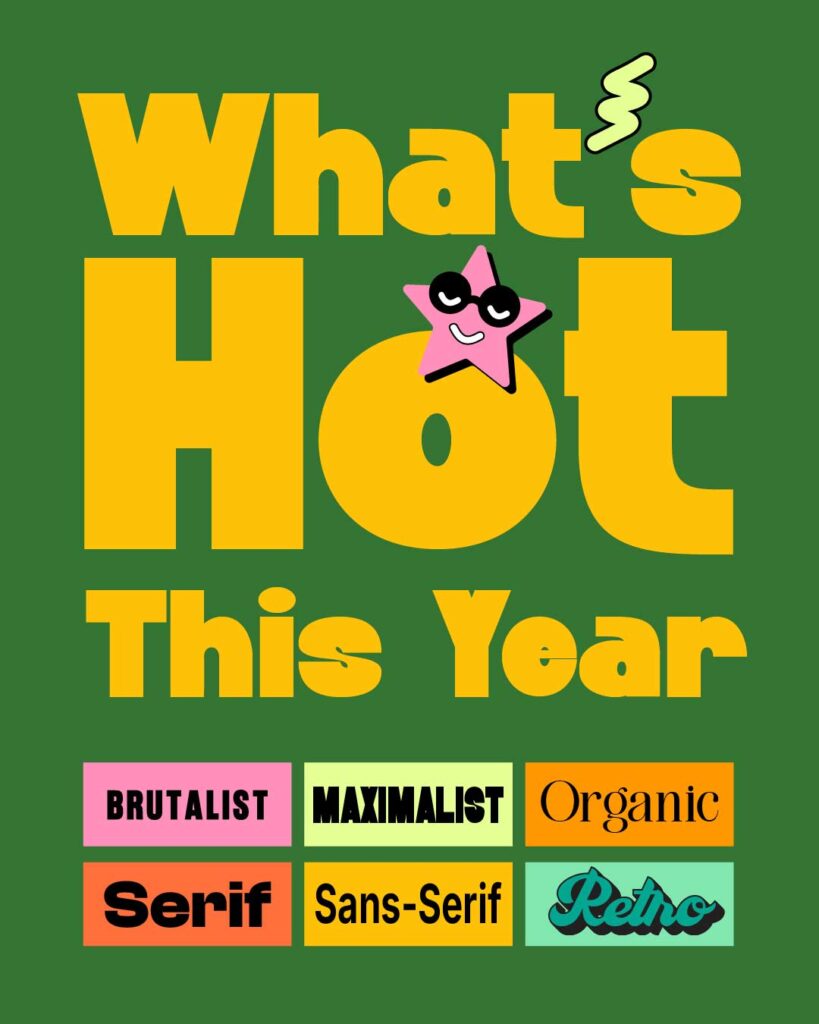
Hottest Typography Trends 2025 You Need to Know
The Rise of Variable Fonts in Typography Trends 2025
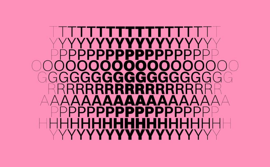
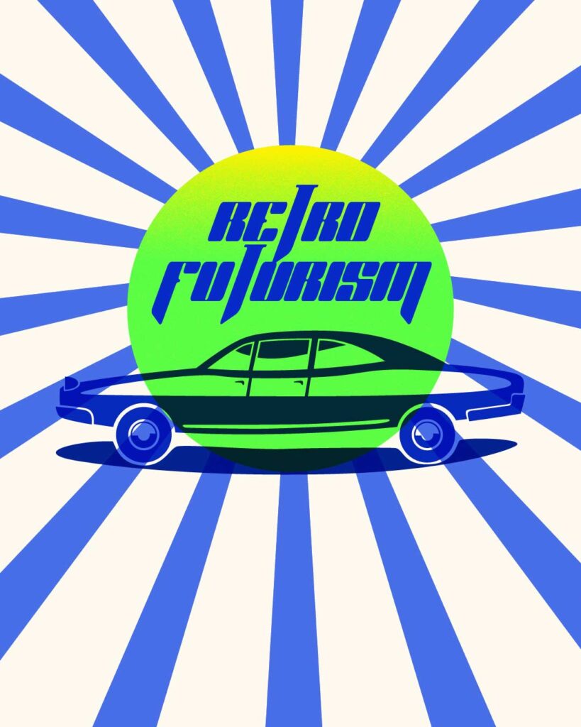
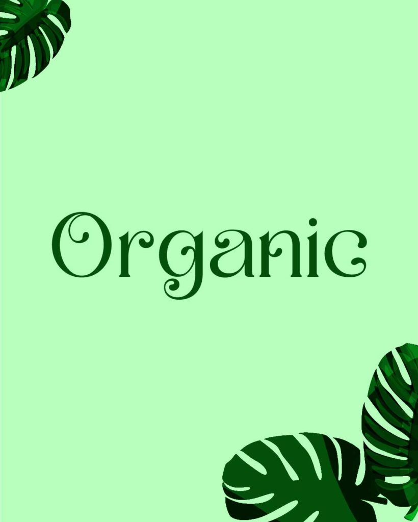
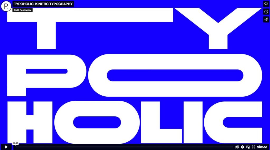
Image credit : Misha Dioxin on Behance
Everything is more accessible in 2025, and that’s where variable fonts come in. Such fonts allow designers to adjust width, weight, slant, and more within a single file. The result? Smoother load times and a whole lot more creative control. Whether you’re designing a responsive site or crafting animations, variable fonts make that a smooth process.
For instance, a font family such as Roboto Flex can adapt to any screen size without loading various font weights, which not only makes it practical but also essential in our mobile-first design world today.
Retro Futurism Meets Modern Minimalism
More 80s arcade meets some kind of Swedish sensibility. Retro futurism returns, now accompanied by clean lines and minimalist palettes. We are witnessing fonts with metallic finishes, pixelated curves, and space-age chic being used on tech websites and fashion campaigns.
Designers are sentimental but not to a fault. A cross between styles past and future, this hybrid style lures us with a combination of a safe, familiar feeling and out-there design that feels of-the-moment and expressive.
Organic and Handwritten Typefaces Are Making a Comeback
In a wired world of screens and machines, where news is condensed to the essence of a sound byte, the human touch is sorely missed. And that’s why organic, handwritten fonts are making a comeback. These styles resemble real pen-and-ink work, featuring brush lettering and imperfect shapes that help bring emotion and personality to your design work.
Wellness, food, and lifestyle brands appreciate these fonts because they convey authenticity and trustworthiness. They say, “We’re real people behind the product,” and that’s relatable to audiences.
Serif Fonts Are Back But Sharper and Sleeker
For decades, they were the kings of the digital world. But now, modern serifs are mounting a quiet, self-reliant comeback. No, these aren’t the dusty, old-school fonts you’re used to. Serifs these days tend to be sharper, slimmer, and full of character.
They’re particularly well-liked in editorial designs, boutique brands, and fashion lookbooks. When used effectively, they project a timeless elegance that’s perfect for brands seeking to appear like a trusted trendsetter.
Brutalist Typography: Raw, Loud, and Unapologetic
There is no balance or harmony here; brutalist design is about disruption. Brutalist typography deliberately breaks rules and is often illegible. Harsh angles, monospaced fonts, heavy weights, a brutal fit, and awkward spacing are all part of the style.
You can see this trend in design portfolios, underground zines, and youth culture websites. It’s not for everybody, but if you want your brand to be brave, weird, and unforgettable, this could be the way.
Maximalist Lettering: Oversized and In-Your-Face
The antithesis of years past’s minimalism, maximalist typography screams, ‘ Look at me. ‘ Font reaches across the screen, overlapping with images, or merges with the background.
It’s typography as fine art. You’ll see it on magazine covers, movie titles, and digital banners. When done well, it’ll stop people in their tracks and make them want to rewatch and share immediately.
Animated Typography for Interactive Digital Spaces
And finally, we see static text give way to moving type. It’s 2025, and animation isn’t just for logos anymore; now it’s a requirement for headlines and digital interfaces. Scroll animations, hovers, and kinetic typography bring life to content.
Tools such as Lottie and GSAP have made it easier than ever to animate type in web and app design. It’s not even an added feature; it’s a design expectation.
Eco-Friendly Typography and Sustainability in Font Design
The world of fonts has just gone sustainable. Designers are selecting fonts that express an eco-friendly attitude — shapes with soft, organic curves, and colours that are neutral and have low ink usage when printed.
Eco-friendly organisations and NGOs favour these fonts. They also set a soothing visual tone that reflects green values and climate consciousness.
Multilingual Fonts for a Global Audience
The world’s design needs fonts with more than one voice. By 2025, the best typefaces will represent several alphabets, including Latin, Devanagari, Arabic, and Cyrillic, in one harmonious aesthetic.
It’s not only inclusive, but also an innovative business. Truly global brands are opting for typefaces that feel the same everywhere, while carrying a local flavour.
Inclusive Typography: Readability Meets Accessibility
An intact kneecap doesn’t cut it any longer as a “nice-to-have. Fonts for 2025 are being made accessible to individuals with visual impairments, dyslexia, and mobile-first users. Consider the overall space, more precise shapes, and increased contrast.
Accessibility-friendly fonts, such as Atkinson Hyperlegible and Lexend , are increasingly being used, especially on government and educational websites. It’s a demonstration that beautiful design can deliver a practical payload.
Typography in Branding: Fonts That Shape Identity in 2025
Typography is not only a matter of beauty, but also of function: of voice. In branding, your font begins speaking just before your product does. “Personalisation” is the latest style. Some of the world’s biggest brands are also their type designers, using personalised typefaces to convey the brand in every design choice, click, and download in our day. In 2025, brands are picking fonts with personality. A high-end watch brand might opt for a refined serif, for example, while a children’s toy brand might favour a childlike, bubbly type.
Real-world example? Compare Spotify’s brand font to that of Vogue. Both are powerful; I don’t deny that at all, but they tell two completely different stories.
Typography in Web and Mobile Design: What’s Trending Now
Design and function have entered the era of personality. Contemporary websites utilise responsive typography, which adjusts font size and weight according to the device. Designers are incorporating fluid typography units (see: clamp()) to adjust type according to screen size.
The result? Text that’s easy to read, scannable, and appealing, regardless of the device. Psychology of Fonts in 2025: What Your Typeface Says About You
Fonts tap into emotion. Big blocky fonts might feel strong. Tender scripts may seem romantic. Psychology-driven design is more critical than ever in 2025.
Marketers are selecting fonts based on emotional triggers — fonts that soothe, fonts that energise, and fonts that persuade. For instance, rounded fonts can be seen as more reliable, while angular fonts can convey a sense of urgency or power.
Typography Tools and Resources Designers Are Using in 2025
Keeping up to date with the right tools. Designers are finding their way to platforms such as:
- Fontshare: Download free, high-quality fonts!
- Google Fonts to add multilingual support.
- Adobe Fonts to integrate qualitative design: a value proposition for bullet-proof designs!
- Fontjoy and Typ. io for AI-generated font pairing recommendations
2 By Jean Snow. A version of this list appears in the April 17, 2016, issue of The New York Times Book Review.
Cultural Influence on Typography Trends 2025: From East to West
Design is profoundly culturally situated. It’s now 2025, and a growing number of brands are latching onto regional aesthetics. Indian typefaces with Devanagari roots, Korean Hangeul-inspired designs, and Arabic calligraphy are blending into global campaigns.
This is more than a trend; it’s a representation. A genuine trust is established when brands utilise a font that reflects the heritage of their target audience.
How to Stay Updated with Typography Trends Every Year
Want to stay current? Read blogs such as Typewolf, Fonts in Use, and the Five Elements blog. Participate in design communities on Behance or Reddit. Watch YouTube channels where people walk you through design case studies.
And, most importantly, try things. Trends are guides, not rules. The best tool you have is always going to be your imagination.
Mistakes to Avoid When Using Typography in 2025
When planning for the year 2025, you might believe, as many others do, that what is essential is already in our face, and you are already well set for it.
Typography is straightforward to mess up. Common issues include:
- Using too many font styles in a single
- mobile design with ultra-light fonts
- Prioritising form over function and readability
Always ask: Does this font effectively convey my message? Does it make reading easier? If not, rethink.
Conclusion: Typography Trends 2025 Will Shape the Future of Design
Typography in 2025 is rich, dynamic, and full of personality. From variable fonts to animated type, every trend tells a story, your story. Great typography doesn’t just look good; it also conveys meaning. It feels right.Need help choosing the right typography, exploring new trends, or learning how fonts can support your brand?
Visit FiveElements.org.in, your trusted destination for all things typography. Discover tutorials, font collections, and expert insights that will take your design work to the next level.