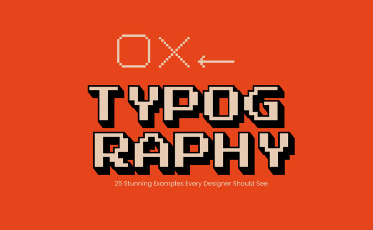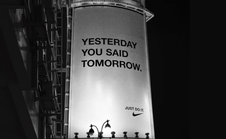
Typography is one of the most powerful tools in a designer’s toolkit. It goes beyond simply choosing fonts—typography helps to shape the way people perceive and interact with your design. Whether you’re working on web design, branding, or print materials, mastering typography is essential for creating professional and engaging visuals. In this post, we’ll cover the best practices for typography that every designer should know to take their designs to the next level.
What is Typography?
Typography is the art and technique of arranging type to make written language legible, readable, and visually appealing. It involves selecting typefaces, point sizes, line lengths, line spacing, letter spacing, and adjusting the space between pairs of letters. Good typography is not just about aesthetics—it also plays a crucial role in the overall user experience.
Best Practices for Typography in Design
1. Choose the Right Typeface for Your Project
The first step in mastering typography is choosing the right typeface. Different fonts evoke different feelings and emotions. For example, serif fonts like Times New Roman convey professionalism and tradition, while sans-serif fonts like Helvetica feel modern and clean.
Tips for Choosing the Right Typeface:
- Consider the tone of your project. Is it formal, playful, or modern?
- Limit yourself to 2-3 typefaces per project to maintain consistency.
- Use display fonts sparingly and for headings only.
2. Establish a Visual Hierarchy
Visual hierarchy refers to the arrangement of elements in a design to signify importance. Typography plays a critical role in guiding the reader’s eye through your design.
How to Create Visual Hierarchy with Typography:
- Use font size to differentiate headings, subheadings, and body text.
- Apply different weights (bold, regular, light) to highlight key information.
- Use contrasting fonts for headings and body text (e.g., serif for headings, sans-serif for body text).
3. Pay Attention to Line Spacing (Leading)
The space between lines of text, known as leading, affects readability. If your lines are too close together, the text will feel cramped; too far apart, and the flow of reading is disrupted.
Best Practices for Line Spacing:
- Use a leading value of 120%-150% of the font size for optimal readability.
- For body text, ensure the lines aren’t too tight or too loose.
- Adjust line spacing depending on the font you’re using and the medium (print vs. digital).
4. Ensure Readability and Legibility

No matter how beautiful a font looks, if it’s not readable, it’s not effective. Readability and legibility are the cornerstones of good typography.
Ways to Improve Readability:
- Choose typefaces that are easy to read at various sizes, especially for body text.
- Avoid using decorative fonts for long passages of text.
- Make sure there is enough contrast between text and background (especially for web design).
5. Use Appropriate Font Pairing
Pairing fonts can add visual interest to your design, but it must be done carefully. A successful font pairing often involves contrasting fonts that still complement each other.
Tips for Pairing Fonts:
- Pair serif and sans-serif fonts to create contrast.
- Use a bold font for headings and a simpler font for body text.
- Avoid pairing fonts that are too similar, as this creates confusion rather than distinction.
6. Consider the Medium (Print vs. Web)
Typography best practices can vary depending on whether you’re designing for print or digital mediums. What works for a printed magazine may not translate well to a website or mobile app.
Typography Considerations for Print:
- Pay attention to print resolution to ensure text is sharp.
- Larger text sizes may be needed for readability in physical formats.
Typography Considerations for Web:
- Screen sizes vary, so responsive typography is important.
- Use web-safe fonts or make sure your fonts are embedded properly.
- Ensure accessibility by using appropriate contrast and size for readability.
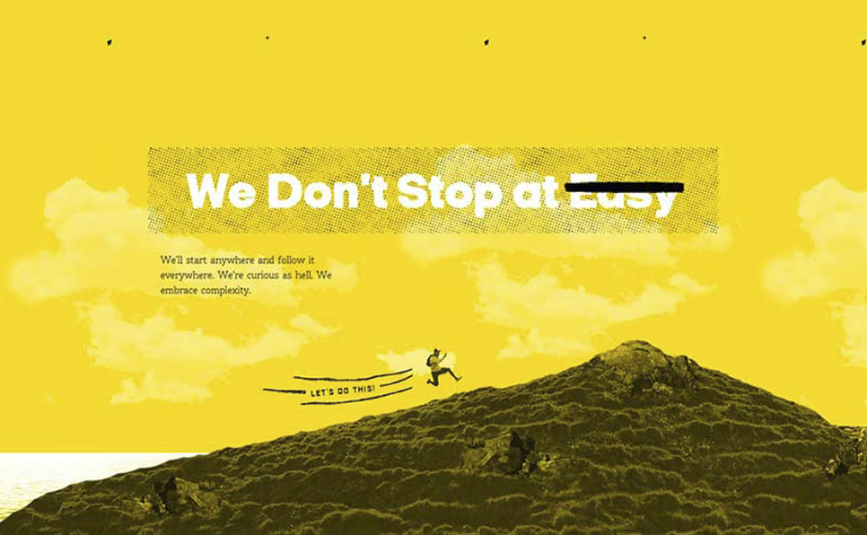
Take a look at inspiring examples like The Black Sheep Agency and Brand Almanac to see how effective typography can enhance branding and visual communication. These agencies showcase stunning use of typography and layout design that balances creativity with functionality.
7. Embrace White Space
White space, or negative space, is just as important as the text itself. It gives your typography room to breathe and can greatly improve the clarity of your design.
Best Practices for White Space:
- Don’t cram too much text into one area—let your text have room around it.
- Use generous margins and padding in your design layouts.
- White space helps direct attention to the most important elements in your design.
Conclusion: Typography is Key to Great Design
Mastering typography can make a huge difference in the success of your designs. From choosing the right fonts to ensuring readability, each aspect of typography plays a role in the user experience. By following these best practices, you’ll create designs that are not only visually appealing but also highly functional.
Liked this post? Check out our guide on ‘The Psychology of Color‘ to elevate your design skills further!