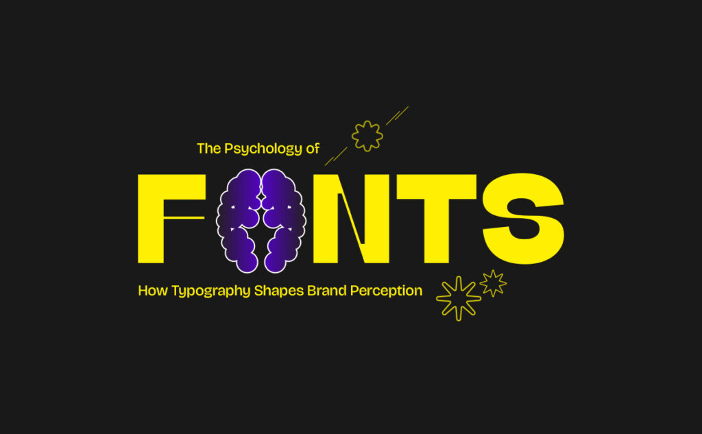
Fonts Speak Louder Than Words
Every day, we scroll, shop, and scan through hundreds of brands, and within seconds, we decide how we feel about them. But here’s the thing most people miss: before the colors, before the copy, before the visuals, it’s often the font that does the talking. That’s the power behind the psychology of fonts, how simple letterforms can shape complex emotions.
Typography isn’t decoration; it’s communication. It carries personality, tone, and emotion in every curve and corner. A single font can make your brand look bold, friendly, timeless, or tech-forward, or, if you choose wrong, it can say none of that. Think of fonts as your brand’s voice; they whisper, shout, or sing your message before you even speak.
Why Your Font Choice Says More Than You Think
Fonts aren’t just about aesthetics, they’re strategic design choices that trigger how people feel. When your audience sees your logo or headline, their brain instantly decides whether your brand feels trustworthy, playful, elegant, or innovative.
Here’s how that magic works:
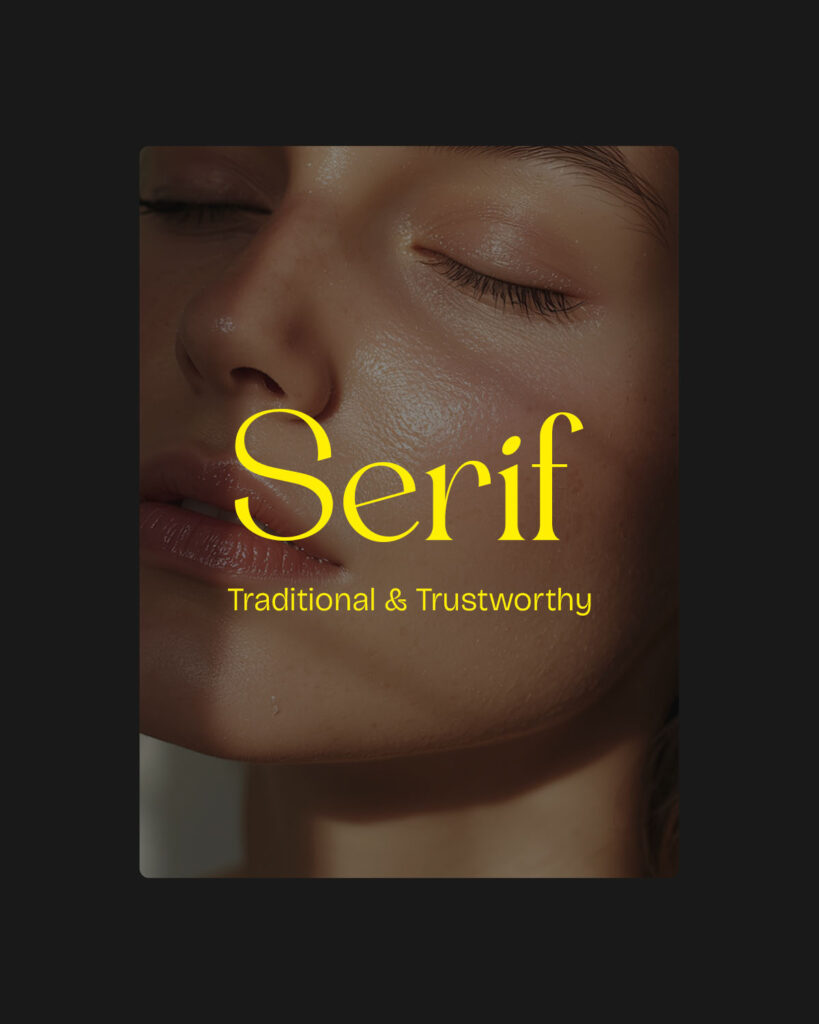
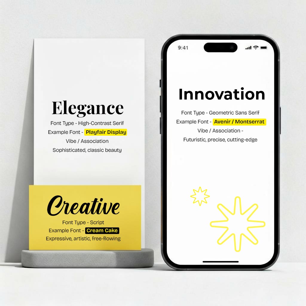
- Serif Fonts – Those little “feet” on the letters? They’re the storytellers of tradition. Think of them as the wise old souls of typography, stable, reliable, classic. Banks, newspapers, and heritage brands love them because they scream trust and authority. (Think Times New Roman, Garamond, Georgia).
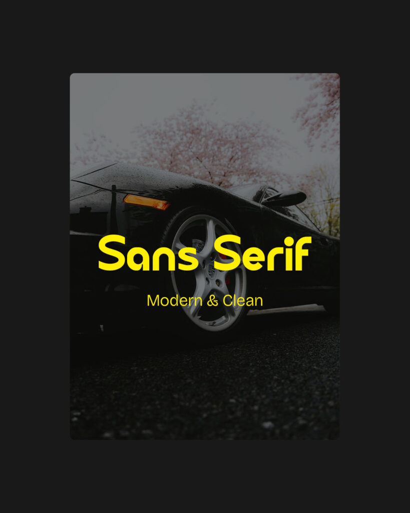
- Sans Serif Fonts – Clean, modern, no extra fluff. They give off a confident, approachable vibe. Perfect for tech, startups, and minimalist brands that value clarity and innovation. (Think Helvetica, Poppins, Google Sans.)
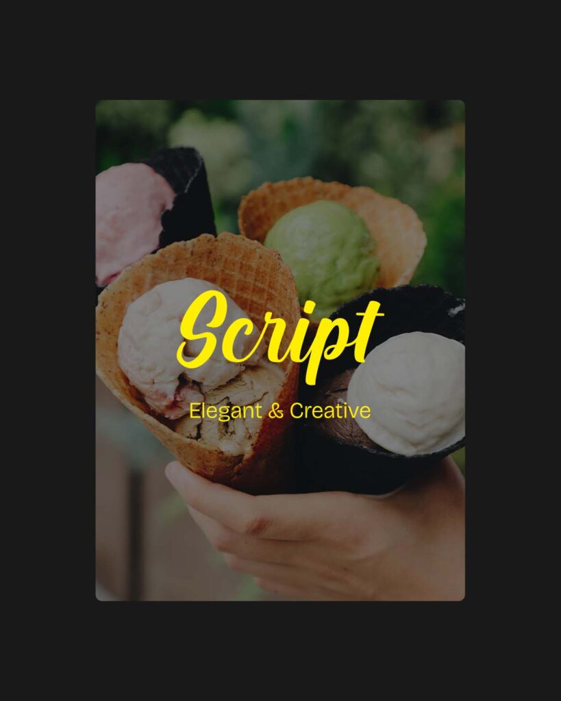
- Script Fonts – Elegant, flowing, and full of personality. Script typefaces add emotion and creativity, perfect for fashion, beauty, and luxury brands. (Think Edwardian Script, Allura, or any typeface that looks handwritten with finesse.)
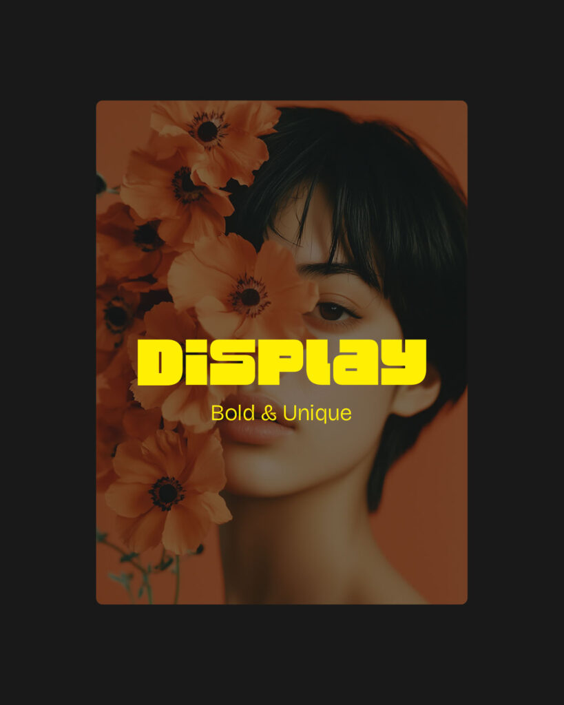
- Display Fonts – The attention-grabbers. These fonts live to stand out, bold, artistic, and often rebellious. They’re great for posters, packaging, and campaigns that want to be remembered. (Think Impact, Lobster, Bebas Neue.)
One simple font switch can completely change how your audience feels, from serious to fun, distant to warm, or corporate to creative.
Loved This?

Inside the Mind: The Science Behind Font Psychology
Believe it or not, your brain reacts to fonts the same way it reacts to faces, emotionally and instinctively. That’s why typography feels so personal.
- Thin strokes = luxury & sophistication. They suggest elegance and exclusivity, think of high-end fashion houses and jewelry brands.
- Bold type = confidence & strength. It’s why sports brands, activism movements, and fitness companies lean toward thicker, stronger lettering.
- Rounded edges = friendliness & warmth. Brands like Airbnb or food startups use them to appear approachable, human, and community-driven.
Cognitive psychology proves that shapes and weights affect emotion. When your typography aligns with your brand’s personality, people “feel” it instantly, even if they can’t explain why.
Let’s look at how some of the biggest brands nail their font game:
- Nike – The slanted, bold sans-serif font looks fast, strong, and powerful, a perfect visual echo of their “Just Do It” attitude.
- Apple – Minimal sans-serif fonts like San Francisco speak innovation, simplicity, and precision – everything Apple stands for.
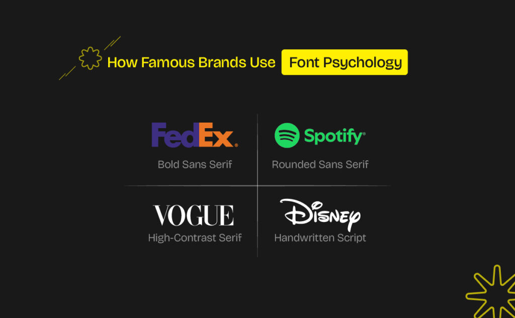
- Vogue – That elegant high-contrast serif (Didot) oozes luxury and authority. You see it and instantly think “timeless fashion.”
- Disney – Whimsical, handwritten, and full of childhood wonder. The font itself feels magical, just like their stories.
- Google – Rounded, colorful letters that look playful yet clear. It says, “We’re smart, but we’re fun.”
- Spotify – With its rounded sans-serif wordmark and vibrant green hue, Spotify’s typography feels youthful, energetic, and approachable.
Real Brands, Real Stories
Every one of these fonts is a visual expression of what the brand believes in. It’s not random, it’s intentional design psychology.
How to Pick the Font That Fits Your Brand
Here’s a quick cheat sheet to make your typography work with your brand, not against it:
| Brand Trait | Font Type | Example Fonts |
| Trustworthy & Traditional | Serif | Garamond, Times, Georgia |
| Friendly & Modern | Rounded Sans Serif | Poppins, Avenir |
| Premium & Elegant | Thin Serif / Calligraphy | Didot, Bodoni, Quicksand |
| Bold & Disruptive | Geometric Sans Serif (Bold) | Futura, Helvetica Neue Bold |
💡 Pro Tip: Pick 3-4 words that define your brand’s personality (like minimal, confident, or playful) and test fonts that visually match those traits. Try your choices in different sizes and mediums – what looks great on your screen may not pop the same way on mobile or print.
Common Font Fails Designers Still Make
Let’s be honest, even great designers slip up with typography sometimes. Watch out for these traps:
- Using too many fonts – Stick to two, max three. Simplicity = strength.
- Chasing trends – That “cool” display font might age faster than you think.
- Ignoring culture & context – What feels playful in one region might read as childish or informal in another.
- Sacrificing readability for style – A beautiful typeface that’s hard to read defeats its purpose.
Good typography doesn’t shout – it speaks clearly and consistently.
Where Fonts Are Heading Next
Typography is evolving fast. AI is helping designers create custom typefaces, and brands are moving toward variable fonts that adapt dynamically across devices. But one thing won’t change: the emotional connection fonts create.
In the future, we’ll see more brands using type to express individuality – fonts that move, morph, and interact. It’s not just about letters anymore; it’s about motion, emotion, and digital presence.
Final Thoughts: Let Your Font Tell the Story
At the end of the day, fonts aren’t just design choices, they’re storytellers. They shape how people feel about your brand long before they know what you do.
Next time you design something, a logo, a pitch deck, even a social post, pause and ask yourself:
“Does this font sound like my brand?”
If it doesn’t, keep exploring. Because when your typography and message align perfectly, that’s when your brand starts to speak its truth.✨ Want to explore more? Check out our previous post – “Best Fonts for Logo Designers in 2025” – and see which typefaces can bring your next idea to life.