Typography mistakes can make or break a design — affecting readability, emotion, hierarchy, and the entire user experience. Whether you’re crafting a website, poster, or brand identity, ignoring the rules of typography can cost you more than just aesthetics. It can confuse your audience, dilute your message, and hurt your brand.
While working on this post, I came across an insightful breakdown by Sumeet Kumaar Kundhiya, a creative director and educator known for clear, thoughtful design principles. His post “Typography Matters” offers several practical reminders that resonate deeply with common typography mistakes – many of which I’ve expanded on below.
Let’s explore some of the biggest type traps designers fall into – and how to avoid them.
You may also like:
- Typography Inspiration: 25 Creative Examples from 2025
- Top 40 Free Typography Fonts Every Designer Should Know
- Typography Cheat Sheet: How to Pair Fonts Like a Pro
- Typography Trends 2025: What’s Hot This Year
- Minimal Typography in Poster Design: When Less Becomes Powerful
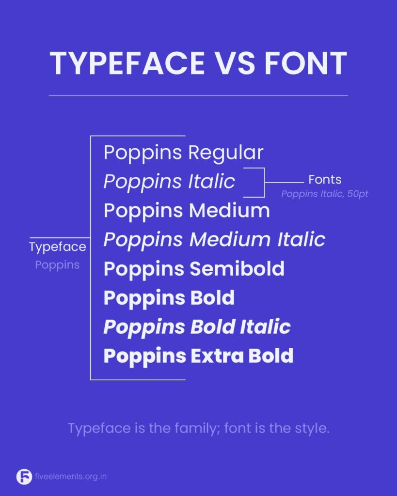
1. Confusing Typeface and Font
A common misconception is using the terms “font” and “typeface” interchangeably. As Sumeet brilliantly puts it, “Think of typeface as the pizza, and font as each slice.” A typeface is the design family (like Garamond), while the font is a specific weight or style (like Garamond Italic). Knowing the difference helps in choosing purpose-driven type rather than just what “looks cool.”
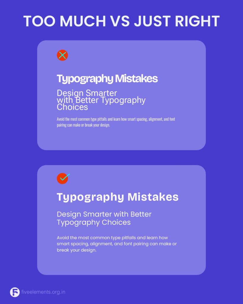
2. Using Too Many Fonts
Typography should bring structure, not chaos. One of the most frequent mistakes is using too many fonts in one layout. This creates clutter, distracts from the content, and weakens hierarchy.
Sumeet’s rule? Stick to two typefaces per design. Choose one for headings, another for body text — and let their contrast define the structure. Font pairings like Poppins + Lora or Inter + Roboto offer both personality and readability without clashing.
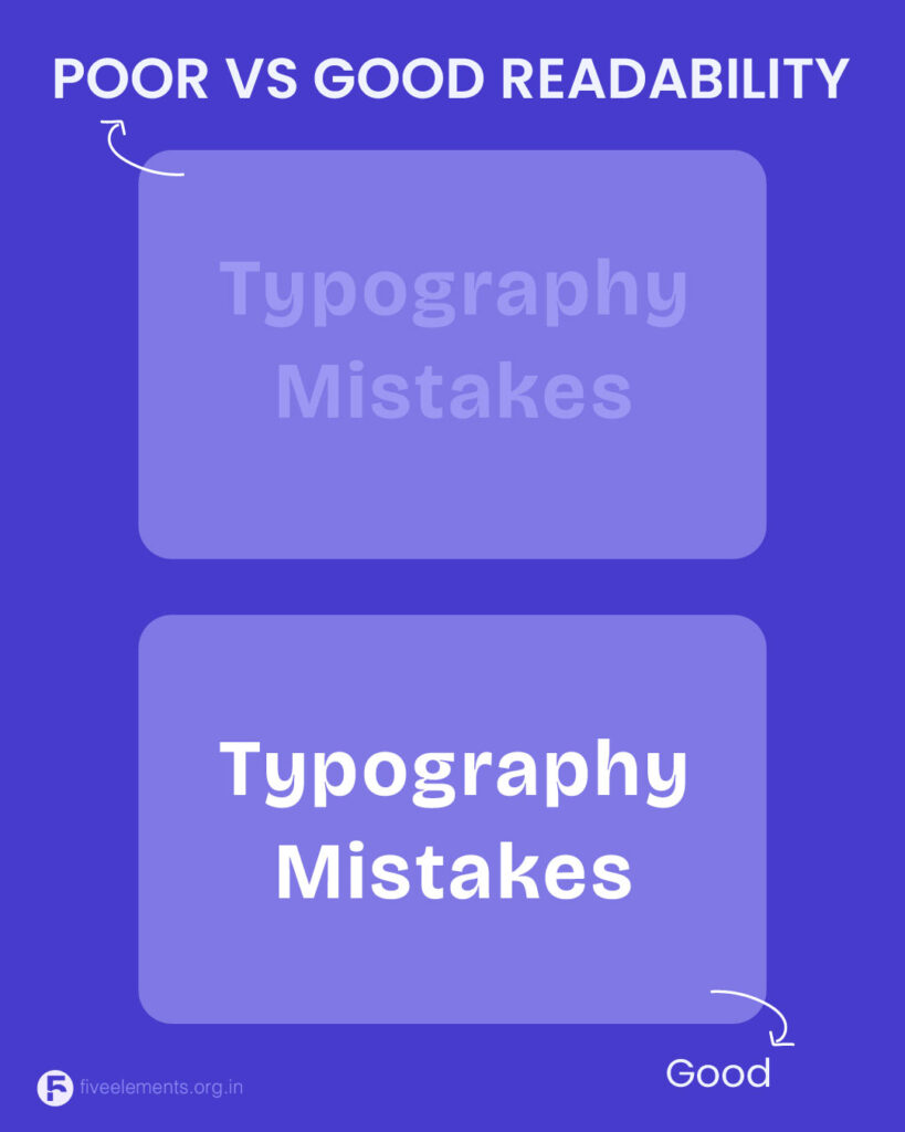
3. Weak Contrast Between Text and Background
Designers often prioritize aesthetics over function, leading to low-contrast typography — like light gray on white or bright yellow on cream. This may look trendy but kills readability.
To fix it:
- Use strong color contrast
- Test in different lighting conditions and on various devices
- Avoid long blocks of text in all caps or italics
As Sumeet emphasizes, “Good design includes everyone.” Accessibility isn’t optional — it’s essential.
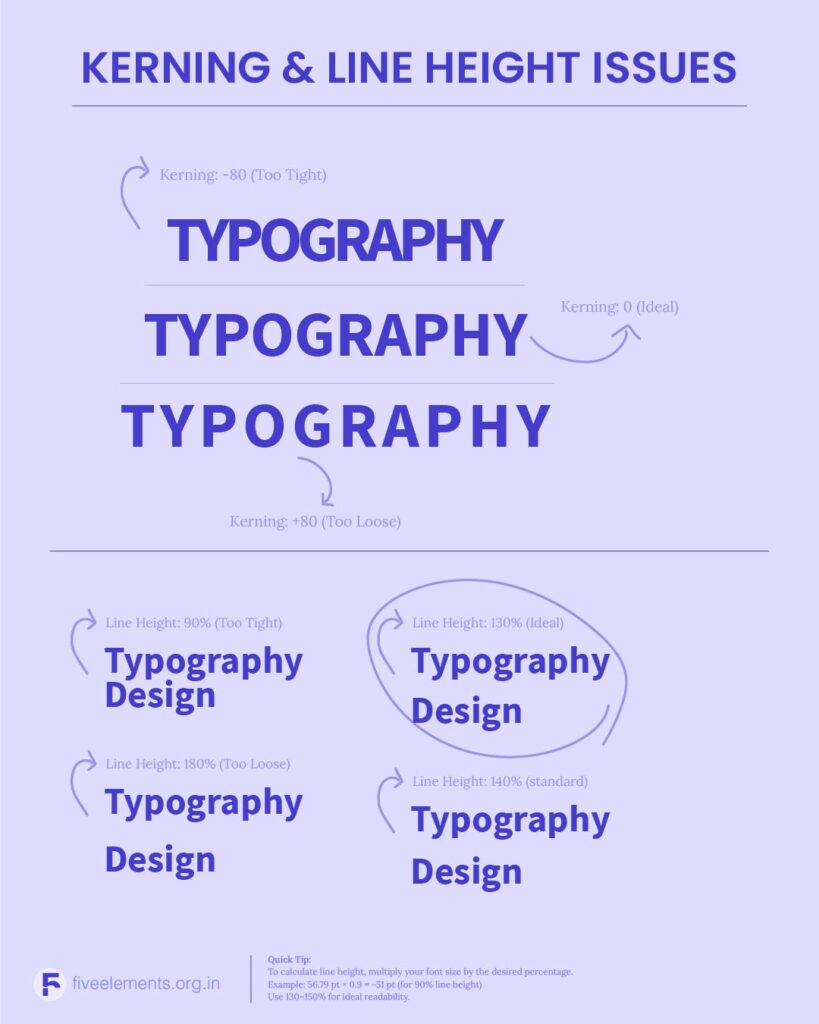
4. Ignoring Line Height and Spacing
Line height (also called leading) impacts the legibility of paragraphs. Too tight, and the lines feel cramped; too loose, and the content feels disjointed.
Best practice:
Set line height to 120%–150% of your font size. If your body text is 16px, aim for 20–24px line height.
Also watch kerning (spacing between individual letters) and tracking (space across a word). Misadjusted spacing can ruin rhythm — another detail Sumeet emphasizes in his anatomy of type.
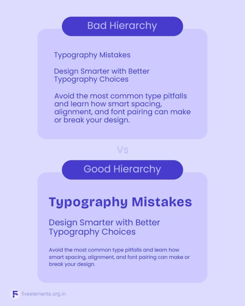
5. Lack of Visual Hierarchy
One of the most overlooked aspects of typography is establishing hierarchy. Every design has a message, but without hierarchy, users won’t know where to start or what matters most.
Hierarchy isn’t about adding boldness or styling at random. It’s about guiding the eye — with purpose.
Sumeet breaks this down into:
- Size (large to small)
- Weight (bold to regular)
- Alignment (left-aligned works best)
- Spacing (group related ideas)
By applying these, your design becomes easier to follow and more visually engaging.
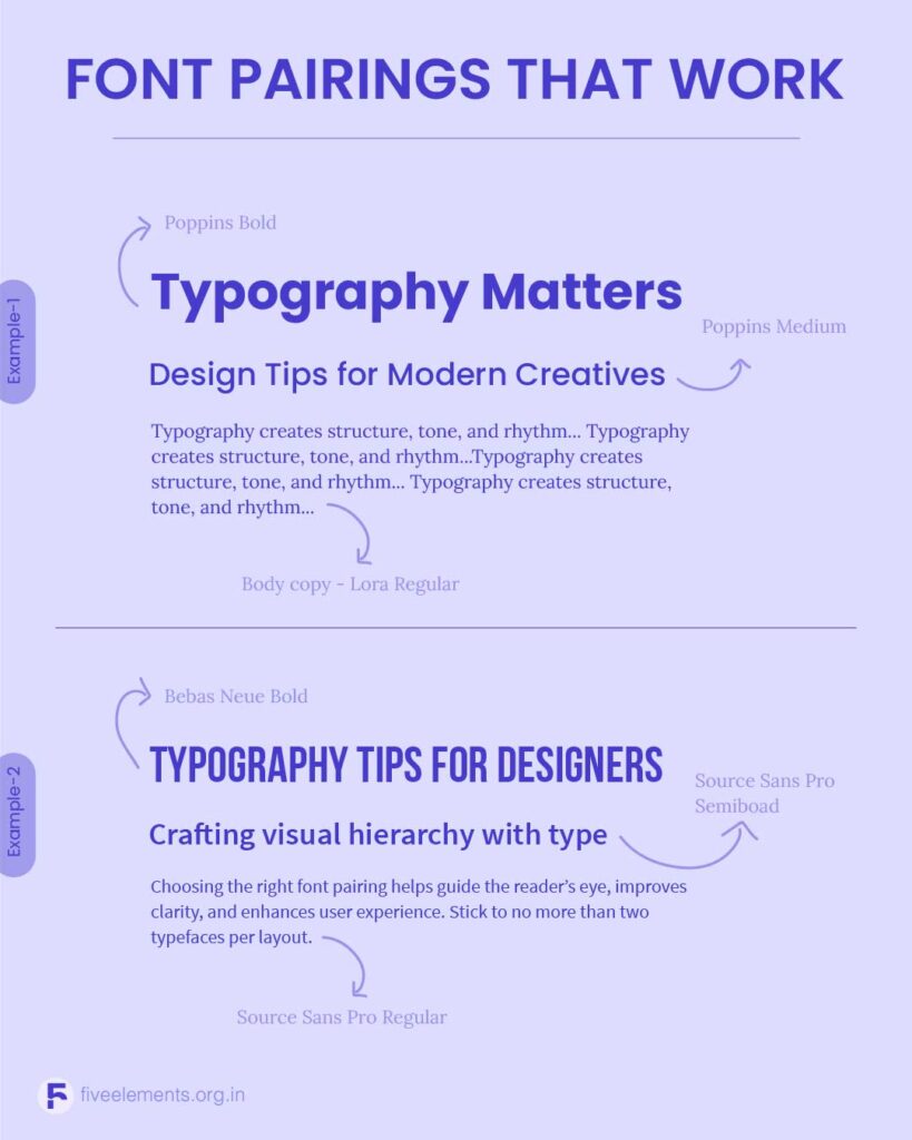
6. Pairing Fonts That Clash
Even with only two fonts, poor pairings can still break your design. When fonts fight for attention, it leads to visual dissonance.
Tip: Use fonts that complement each other in tone and structure. A serif + sans-serif combo often works well (e.g., Bebas Neue + Source Sans Pro or Oswald + Raleway). Avoid pairing fonts that feel too similar or radically different.
7. Skipping Accessibility Checks
Design is for everyone. Small type, poor contrast, or decorative fonts used in body text all make content harder to access — especially for users with vision challenges.
To keep your typography inclusive:
- Use at least 12pt for body copy
- Avoid all-caps in long blocks
- Test your design across screen sizes
Prioritize contrast and clarity
Final Thoughts
Typography isn’t decoration. It’s structure, rhythm, tone, and clarity — all rolled into one. As Sumeet Kumaar Kundhiya puts it, “Typography works best when it doesn’t call attention to itself.” The goal is to make type feel effortless, guiding the user smoothly through your content.
By avoiding these common mistakes — and embracing purpose-driven type — you not only elevate your design but also create meaningful, memorable experiences.