Inside the Post
Typography is the backbone of great design. In this beginner-friendly guide, we break down the essentials of typography—from the core principles and 2025 design trends to tools, mediums, and problem-solving tips. Whether you’re designing for web, print, or social media, this post gives you everything you need to start using type like a pro.
You may also like:
- Typography for Beginners: Your Complete 2025 Design Guide
- Top 10 Free Design Resources Every Designer Should Bookmark
- How to Avoid Common Typography Mistakes
- 25 Poster Design Inspiration Ideas for 2025 That Will Blow Your Mind
- The Magic of Minimalist Design: Why Simplicity Stands Out
Introduction
Typography for beginners is more than just choosing fonts—it’s about understanding how type influences design, communication, emotion, and structure. If you’re new to the world of design, mastering typography can instantly elevate your work—whether you’re creating a logo, website, poster, or Instagram post.
This guide walks you through the fundamentals of typography, the top trends for 2025, essential tools, and how to avoid common mistakes—all explained in simple, beginner-friendly terms.
Typography For Beginners Fundamentals: Building Your Design Foundation
Typography is the art and technique of arranging type to make written content not only legible but also visually engaging. It includes font selection, spacing, alignment, and layout. For beginners, mastering a few basics can go a long way.
Here are the core elements of typography:
- Typefaces vs. Fonts: A typeface is the family (like Roboto), while font is a specific style (Roboto Bold 14pt).
- Hierarchy: Bigger and bolder text catches attention first. Use size and weight to guide the reader’s eye.
- Spacing: Don’t cram text. Line spacing (leading), letter spacing (tracking), and space between letter pairs (kerning) all improve readability.
- Alignment: Left-aligned text is easiest to read. Avoid centering body text unless it’s a short quote.
Typography is about balance. Every type choice should enhance the message you’re trying to send.
Typography Trends Shaping 2025 Design
Typography trends change every year—and 2025 is all about bold expression with clean usability. Here’s what’s catching designers’ eyes this year:
- Retro Modern Fonts: A blend of 70s/80s styles with modern execution is trending. Think bold curves with a minimalist approach.
- Variable Fonts: These dynamic fonts allow designers to control width, weight, and slant—great for responsive and interactive designs.
- High Contrast Serifs: These fonts offer elegance and sophistication, often used in luxury branding.
- Big, Bold Headlines: Designers are moving toward oversized type with lots of white space for impact.
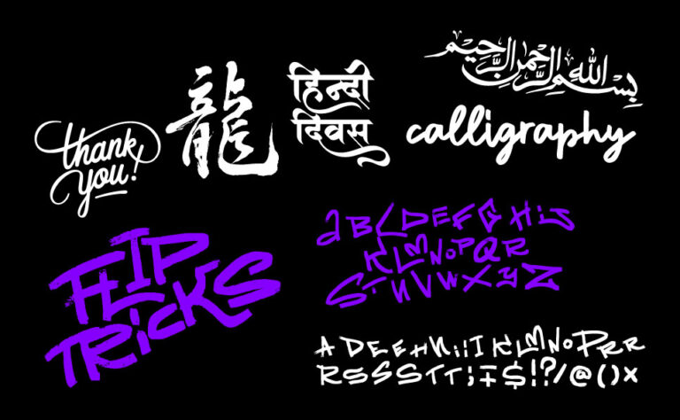
- Handwritten Type & Calligraphy: Adding a human touch through custom lettering continues to grow, especially in lifestyle and personal brands.
Keeping an eye on trends doesn’t mean following them blindly—but understanding them can inspire your work.
Mastering Technical Typography Skills
Typography isn’t only visual—it’s technical too. As a designer, here are some practical skills you’ll want to sharpen:
- Font Pairing: Learn how to combine fonts that contrast well. For example, a serif headline with a sans-serif body.
- Line Length: Ideal body copy line length is around 50–75 characters. Too long, and the reader gets lost.
- Responsive Type: Always check how your text scales across devices (desktop, tablet, phone).
- Grid Systems: Use column grids to align text with other elements. It keeps your layout organized.
- Accessibility: Ensure text is legible for everyone. Use good contrast and avoid small fonts.
Practice by redesigning simple layouts, like a business card or a blog post, and apply these principles.
Typography Across Different Mediums
Typography behaves differently depending on the platform. Here’s how it varies across key design mediums:
Web Design
- Use web-safe fonts (Google Fonts is a great place to start).
- Design for responsiveness: Type must look good on mobile and large screens.
- Load speed matters—don’t use too many font files.
Print Design
- Use CMYK-safe fonts that translate well to physical formats.
- Pay attention to paper texture and ink bleed, which can affect readability.
- You can experiment more with artistic type treatments in print than on screens.
Social Media
- Choose bold, high-contrast fonts that stand out in small sizes.
- Keep text minimal—design for instant attention.
- Maintain brand consistency across posts.
Each platform requires a slightly different approach, but your foundation in typography remains the same.
Typography Tools and Resources for Designers
The right tools can speed up your typography learning curve. Here are some free and paid resources every beginner should explore:
- Google Fonts – A free library of open-source fonts for web and print.
- Fontpair.co – Great for exploring font pairings.
- Adobe Fonts – Premium-quality fonts for all Adobe Creative Cloud users.
- WhatFont (Chrome Extension) – Lets you identify fonts used on websites instantly.
- Canva / Figma – Both offer user-friendly interfaces and plenty of font options for quick design work.
- Typewolf.com – Explore real-world font usage and curated inspiration.
- Fontjoy.com – AI-based font pairing tool to find combinations that work.
Most importantly, experiment! Download fonts, create sample posters, and trust your instincts.
Solving Common Typography Challenges
Even experienced designers struggle with typography. Here are some beginner issues—and how to fix them:
- Using Too Many Fonts: Stick to 2–3 fonts max. Consistency creates harmony.
- Poor Font Choice: Don’t use decorative fonts for body text. Choose legible options first.
- Crowded Layouts: Give text breathing space. Use white space effectively.
- Overlooking Contrast: Make sure your text stands out from the background. Low contrast = poor readability.
- Not Testing on Real Devices: What looks good on your screen might fail on a phone. Always preview.
Learning typography is like learning to cook—your first few dishes may be basic, but with practice, your flavor (style) improves.
Final Thoughts: Typography Is Where Design Starts
Typography is the invisible glue that holds design together. It sets the mood, tone, and function of your message. For beginners, the journey starts with understanding the basics—but it grows with observation, experimentation, and practice.
So start simple. Use clean fonts, play with hierarchy, and watch how others use typography in the real world. With time, your type choices will stop looking like guesses and start feeling like design decisions.
Designing with type is as much about knowing what to do as it is about avoiding what not to do—this guide on common typography mistakes breaks it all down.