
When you think of brands like Coca-Cola, Spotify, or Airbnb, their colors come to mind even before their logos. That’s the power of a well-built color palette—it silently shapes how your audience feels and remembers your brand.
If you want to build a color palette for your brand that doesn’t just look good but feels right, this guide is for you. We’ll go beyond generic advice and focus on audience emotions, usability, and brand personality.
🔍 Overview: What You’ll Learn
In this article, you’ll discover a step-by-step approach to building a strategic brand palette that:
- Reflects your audience’s emotional expectations
- Supports your brand story and tone
- Works consistently across web, print, and social media
- Balances creativity with accessibility and usability
- Leverages design tools without relying blindly on them
Let’s break it down.
You may also like:
- Typography for Beginners: Your Complete 2025 Design Guide
- Top 10 Free Design Resources Every Designer Should Bookmark
- How to Avoid Common Typography Mistakes
- 25 Poster Design Inspiration Ideas for 2025 That Will Blow Your Mind
- The Magic of Minimalist Design: Why Simplicity Stands Out
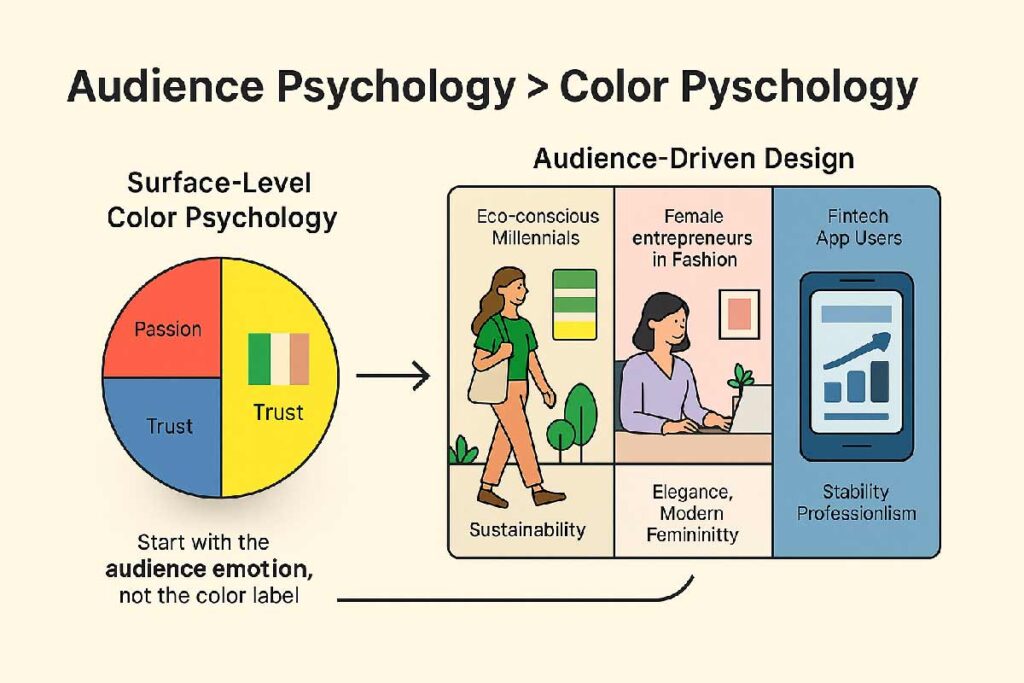
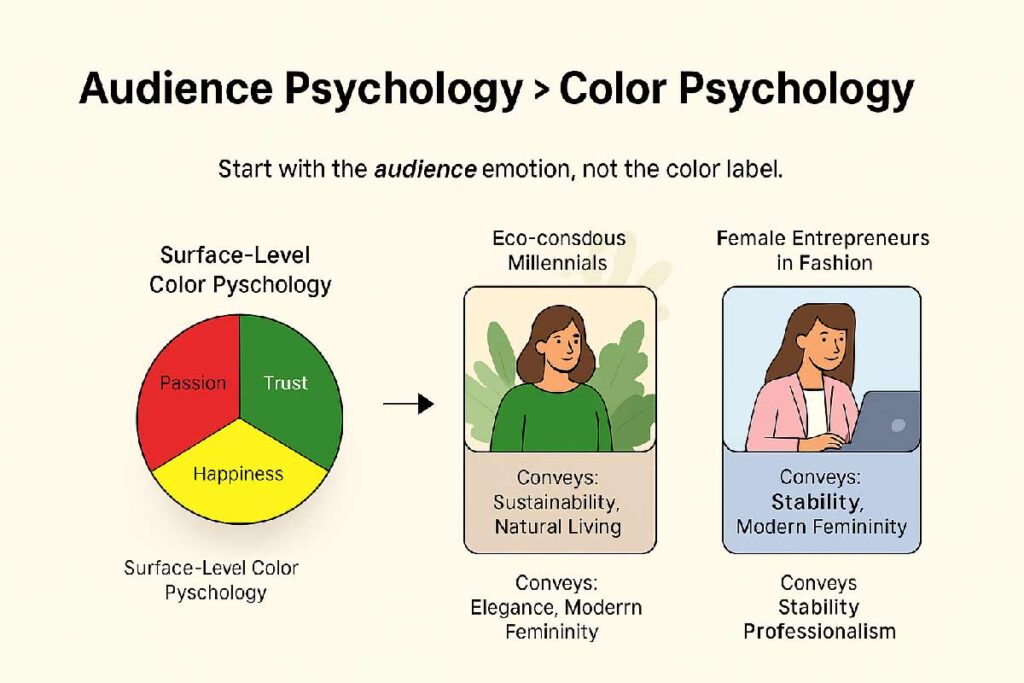
1. Start with Audience Psychology, Not Color Charts
Most blogs will tell you red = passion, blue = trust, yellow = optimism. But that’s surface-level. If you want to build a color palette for your brand that resonates, ask a deeper question:
What emotional response should my audience feel when they see my colors?
Examples:
- Eco-conscious millennials? Use earthy greens and soft neutrals.
- Fashion-forward women entrepreneurs? Go with muted pastels and luxurious tones.
- Fintech users? Choose stable, cool hues like navy, steel, or teal.
This mindset shift—from color meaning to audience emotion—is what makes your palette strategic.
2. Define Your Visual Personality
Vague brand traits like “bold” or “creative” are not enough. Instead, describe your brand as a person:
- Is it a sophisticated gentleman? → Use wine red, navy, cream
- A playful street artist? → Try magenta, lime green, and cyan
Translate personality into color. Your palette should tell a story, not follow trends.
3. Choose a Strong Core Color with Intent
This is your brand’s emotional anchor. Ask:
- Does this color work across digital and print?
- Does it look great on both dark and light backgrounds?
- Is it versatile in a monochrome version?
You’re not choosing a favorite color—you’re choosing a foundation. Adjust brightness and temperature as needed.
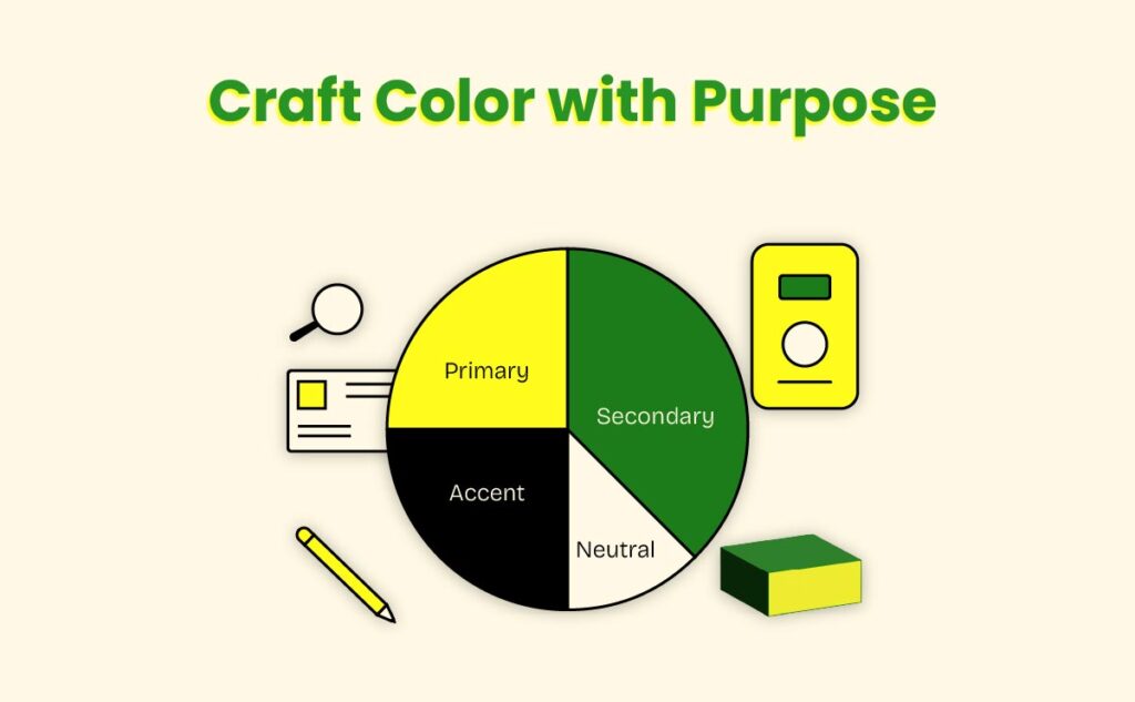
4. Build Supporting Colors: Secondary, Accent & Neutral
Too many brands overuse one color or mix unrelated ones. Create a system:
- Secondary Colors (2–3 max): Support your core across sections or categories
- Accent Color: Use sparingly for buttons, highlights, or alerts
- Neutral Shades: Give space—whites, greys, soft beiges, or charcoals
💡 Pro Tip: Test your palette inside real layouts like web buttons or social posts. Many palettes break outside of swatch format.
5. Color Theory Is a Guide—Not a Rulebook
Complementary, analogous, or triadic schemes are useful—but they’re not gospel.
Designers know when to break the rules:
- Sometimes contrast works better than harmony
- Sometimes dull colors outperform flashy ones
If it looks right and feels on-brand, it probably is.
6. Think in Real Use Cases
Before finalizing anything, test your colors across:
- UI buttons, menus, cards
- Print brochures or packaging
- Slide decks, ads, and mockups
- Social media posts
- Mobile or app design
Ask yourself:
“Does this palette work in 10+ brand scenarios?”
Don’t just make it pretty—make it practical.
7. Make It Accessible
A good color palette is inclusive. Run these checks:
- Does text over background meet contrast standards?
- Can colorblind users distinguish your tones?
- Do you rely solely on color to convey meaning?
Use tools like Stark, Color Oracle, or WebAIM to stay compliant.
Inclusive = Professional.
8. Use Tools, But Trust Your Eye
Try these tools to build a color palette for your brand:
- Coolors.co – Easy palette generator
- Adobe Color – Explore harmony rules
- Happy Hues – Real-use previews
- Khroma – AI suggestions based on your taste
But remember: Tools guide you. Your creative eye makes it real.
But remember: Tools guide you. Your creative eye makes it real.
A well-crafted palette is not decoration—it’s tone, emotion, and identity.
So don’t rush the process. Build intentionally. Test thoroughly.
And most importantly—stay consistent.
Because a strong palette isn’t about color alone—it’s about how it makes your brand feel.


An incredibly well-written article.
Thank you for your wonderful comments