When Massimo Vignelli said, “The life of a designer is a life of fight: fight against the ugliness,” he wasn’t just talking about bad design—he was urging us to choose clarity, simplicity, and elegance. Nowhere is this more evident than in the world of poster design, where minimal typography has become more than just a style—it’s a statement.
Let me take you on a journey where words meet space, and design breathes with intention.
You may also like:
- Typography for Beginners: Your Complete 2025 Design Guide
- Top 10 Free Design Resources Every Designer Should Bookmark
- How to Avoid Common Typography Mistakes
- 25 Poster Design Inspiration Ideas for 2025 That Will Blow Your Mind
- The Magic of Minimalist Design: Why Simplicity Stands Out
The Poster on the Wall
I remember walking into a gallery one rainy evening in Delhi. Among a flood of visuals, textures, and colors, there was one poster that stopped me. It had only five words, placed in the center in bold Helvetica, surrounded by pure white space. No images. No embellishments. Yet, I couldn’t take my eyes off it.
Why? Because minimal typography has a voice—a powerful, unwavering voice that doesn’t shout but speaks directly to the soul.
The Philosophy Behind Simplicity
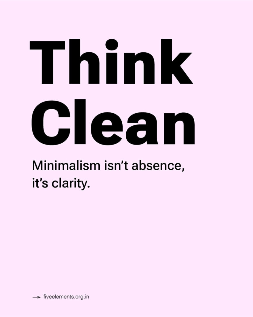
Minimalism is not the absence of design. It’s the conscious choice to let go of the non-essential.
Legendary industrial designer Dieter Rams famously said: “Good design is as little design as possible.” And that’s what minimal typography embodies. It allows the message to shine without competition. In poster design—where grabbing attention within seconds is crucial—this approach works like magic.
Clean typography paired with smart spacing, contrast, and alignment creates a visual rhythm. It doesn’t overwhelm. It invites. It allows your eyes to rest and absorb.
The Craft of Choosing the Right Type
Designers who master minimalism understand the weight of each decision.
Paula Scher once said, “Typography is painting with words.” And when designing minimal posters, each word becomes a brushstroke.
Choosing the right font is the first and most crucial step. Sans-serifs like Helvetica, Avenir, or Neue Haas Grotesk are popular in modern poster design for their neutral, readable nature. Sometimes, a bold serif like Playfair Display or Georgia can be used to add contrast while still maintaining elegance.
But it’s not just about choosing a pretty font. It’s about choosing one that fits the tone, purpose, and message of the poster. Because in minimal typography, every decision matters.
The Power of Space
White space isn’t empty—it’s active. It gives the type room to breathe, demands attention, and provides balance.
Take Apple’s advertising posters as a prime example. One product. One line of text. And silence around it. That silence is not lack—it’s presence.
Designers use white space and alignment to guide the viewer’s eye. Whether left-aligned or center-aligned, consistency is key. And when type is placed with intention, the result is a design that feels thoughtful and human.
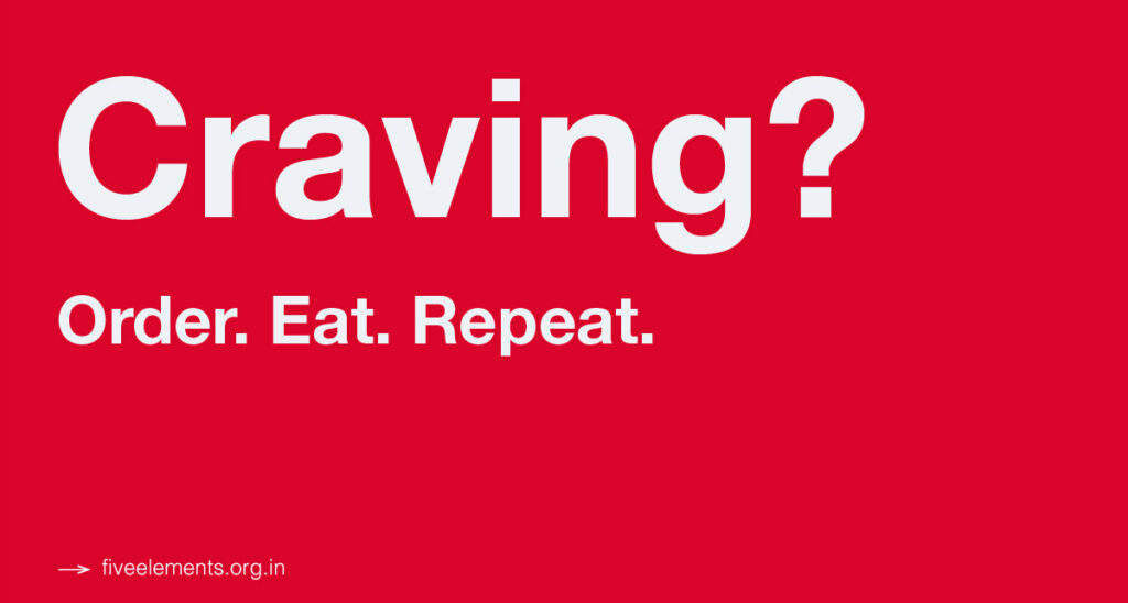
Another standout example is Zomato. Their posters have become a masterclass in minimal copy and typography. Whether it’s a single witty line like “Dil khol ke khana order karo” or just one bold word like “Craving?”—Zomato’s design team relies heavily on font weight, hierarchy, and white space. The background is often a flat red, the type is sans-serif, and there’s nothing to distract from the message. It’s punchy, readable, and perfectly on-brand.
Their visual identity proves that you don’t need visuals when your type speaks the language of your audience. Humor, emotion, and urgency—all packed into just a few words. That’s the power of minimal typography done right.
Modern Poster Trends with Minimal Type
In 2025, we’re seeing a rise in oversized typography, muted color palettes, and grid-based layouts. The trend is not to fill space—but to own it with purpose.
- Bold Headlines + Nothing Else: Headlines in 120pt+ with just a line of supporting text.
- Monochrome Themes: Black and white with a single accent color.
- Custom Typefaces: Designers creating their own stripped-down letterforms that feel raw and authentic.
These trends echo the words of Vignelli again: “I like design to be semantically correct, syntactically consistent, and pragmatically understandable.”
Tips from the Trenches
Here are a few lessons I’ve learned (and borrowed from the masters) while working on minimalist posters:
- Start with the message. Before design, write the words. What must the audience know, feel, or do?
- Use one font, two weights max. Let weight and size define hierarchy.
- Let silence speak. Resist the urge to fill space.
- Be bold in restraint. Don’t confuse minimalism with safety. Simplicity is brave.
- Print test. Always preview your design at actual size. Minimal layouts must be pixel-perfect.
Famous Posters That Got It Right
- Bauhaus Exhibition Posters – Simple grids, bold sans-serif type, and pure function.
- Nike “Just Do It” Launch Posters – One line. Maximum impact.
- The New York Times Typographic Posters by Paula Scher – Where letters become design elements.
- Zomato’s Outdoor Campaigns – Proof that short, smart copy + clean type = unstoppable attention.
These designs prove that minimalism doesn’t mean boring—it means intentional, emotional, and timeless.
Final Words: Let the Type Speak
Minimal typography isn’t about designing less. It’s about designing better.
In a world overloaded with visuals, minimal poster design invites us to pause, reflect, and engage. It’s where typography becomes more than text—it becomes art. As a designer, if you can communicate with just a few words and lines, you’ve already won half the battle.
So next time you’re creating a poster, take a step back. Strip it down. Let the typography carry the message—and trust that less truly can be more.