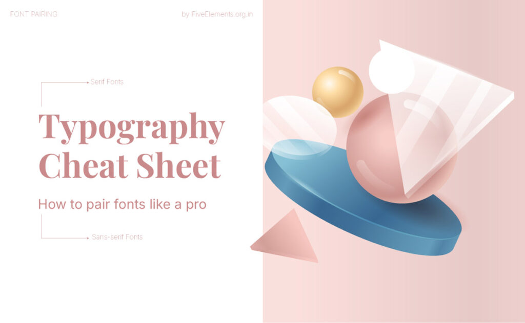
Introduction
Typography is more than just picking pretty fonts—it’s the heartbeat of visual communication. Whether you’re building a brand, designing a website, or creating a social media post, font pairing plays a vital role in how your message is perceived. That’s exactly why I created this typography cheat sheet—a simple, no-fluff guide to help you pair fonts like a pro and bring visual harmony to your design work.
Whether you’re just starting out or brushing up on the basics, this guide is packed with typography tips to help you create clean, intentional, and beautiful type combinations that work across all types of design.
You May Also Like…
Want to dig deeper into typography? Here are some more blog posts from FiveElements you’ll love:
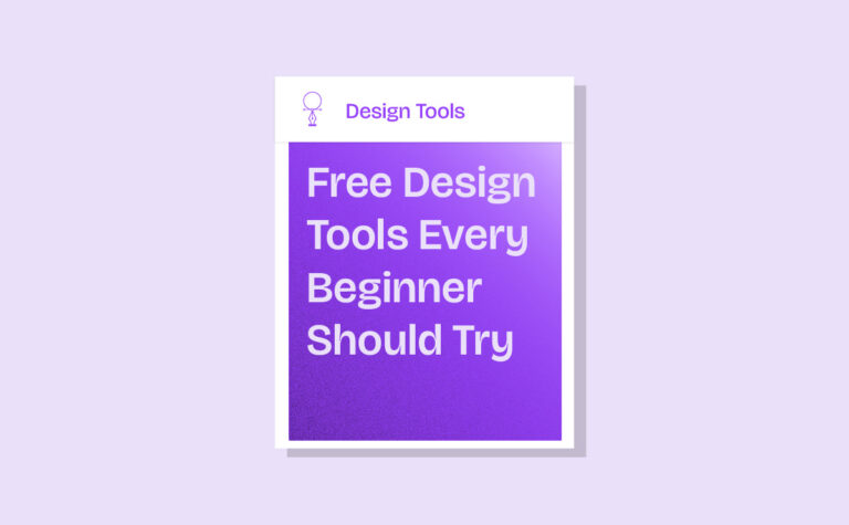
- Typography for Beginners: A Complete Guide to Getting Started
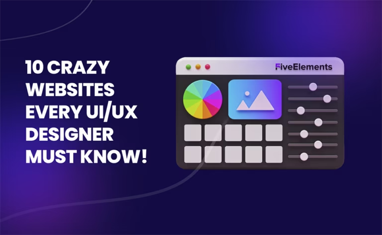
- Typography Inspiration: 25 Stunning Examples Every Designer Should See
- How to Avoid Common Typography Mistakes
- Top 40 Free Typography Fonts Every Designer Should Know
- 25 Poster Design Inspiration Ideas for 2025 That Will Blow Your Mind
Why Font Pairing Matters in Typography
Typography has its own voice. And when you combine fonts, you’re creating a conversation between styles. A good type pairing can guide focus, build hierarchy, and shape how people feel about what they’re seeing. On the other hand, a poor pairing can create confusion or clash with the message you’re trying to deliver.
This typography cheat sheet gives you the confidence to mix fonts with purpose, style, and clarity.
1. Know Your Typography Categories
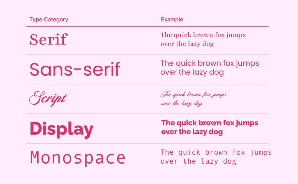
Before jumping into font pairings, it’s important to understand the basic categories of fonts. These lay the foundation for every smart combination.
- Serif: Fonts with strokes at the ends of letters (like Playfair Display). They feel traditional, elegant, and timeless.
- Sans-serif: Clean fonts without strokes (like Poppins or Inter). They’re modern and highly readable.
- Script: Cursive or handwritten fonts, used for decorative flair in logos or headlines.
- Display: Eye-catching and expressive fonts made for headlines or large-scale impact.
- Monospace: Each letter takes up the same space. Great for tech, coding, or minimal layouts.
Most strong font pairings involve contrast—like pairing a serif with a sans-serif—for a balanced, readable result.
2. Serif + Sans-Serif: A Timeless Duo
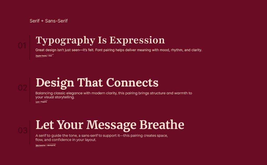
One of the most dependable font combinations is a serif header with a sans-serif body. The contrast keeps things structured and stylish without overcomplicating the design.
Example:
Playfair Display (serif) for headings
+
Lato or Inter (sans-serif) for body text
This pairing is elegant, modern, and works beautifully for websites, editorial layouts, portfolios, and branding.
3. Create Visual Contrast—With Balance
Pairing fonts isn’t only about type families. You can also create harmony through contrast in:
- Size – Make your headline clearly larger than your body text
- Weight – Use bold titles with light text underneath
- Style – Add italics or caps, but only when it enhances the tone
Pro Tip: If your fonts look too similar, they’ll blend in. Too different? They’ll clash. Aim for just enough difference to guide the reader’s eye, without pulling focus in every direction.
4. Match the Mood of Your Fonts
Fonts have personality—just like people. Some are playful, some are formal, and some are made for modern, tech-savvy spaces. Ask yourself:
- Does the mood match the brand or message?
- Do these fonts feel like they “belong” together?
- Are you mixing a soft, classic serif with a sharp geometric sans-serif for a reason?
Example to avoid: Pairing a 90s retro display font with a minimalist startup-style font can feel off—unless that contrast is intentional.
5. Use Font Pairing Tools to Experiment
Even the best designers use tools to explore combinations quickly and efficiently. Here are some great ones to try:
- Fontjoy – AI-based font pairing generator
- Google Fonts Pairings – Curated combos by the design community
- Canva Font Combinations – Visual and beginner-friendly
- Typ.io – Browse real websites using effective font pairings
These tools will train your eye and save time when exploring new ideas.
6. Keep It Simple: Two Fonts Max (Three If You Must)
Less is more. Using too many fonts makes your layout feel chaotic and inconsistent. A solid rule of thumb:
- Font 1 – Headline / Titles
- Font 2 – Body text / Paragraphs
- Font 3 (optional) – Callouts or accents like quotes or captions
This structure gives you enough visual variety without going overboard.
Closing Note
Typography isn’t about rules—it’s about rhythm, intuition, and expression. With this typography cheat sheet, you now have the foundation to start combining fonts with confidence, clarity, and creativity. Don’t be afraid to explore, refine, and make bold choices. Trust your eye—and trust the process.
Because in the end, great design doesn’t speak louder—it speaks clearer.
Here’s to better design, one font pair at a time.
See you in the next post.