Introduction
The psychology of color plays a crucial role in design, making color one of the most powerful tools at your disposal. Beyond creating visually appealing designs, color has a profound psychological impact that influences how people feel, think, and act. By understanding the psychology of color, you can create designs that resonate deeply with your audience and elevate your projects to the next level.
The Emotional Impact of Colors
Colors evoke emotions and set the mood for your design. For example:
Blue
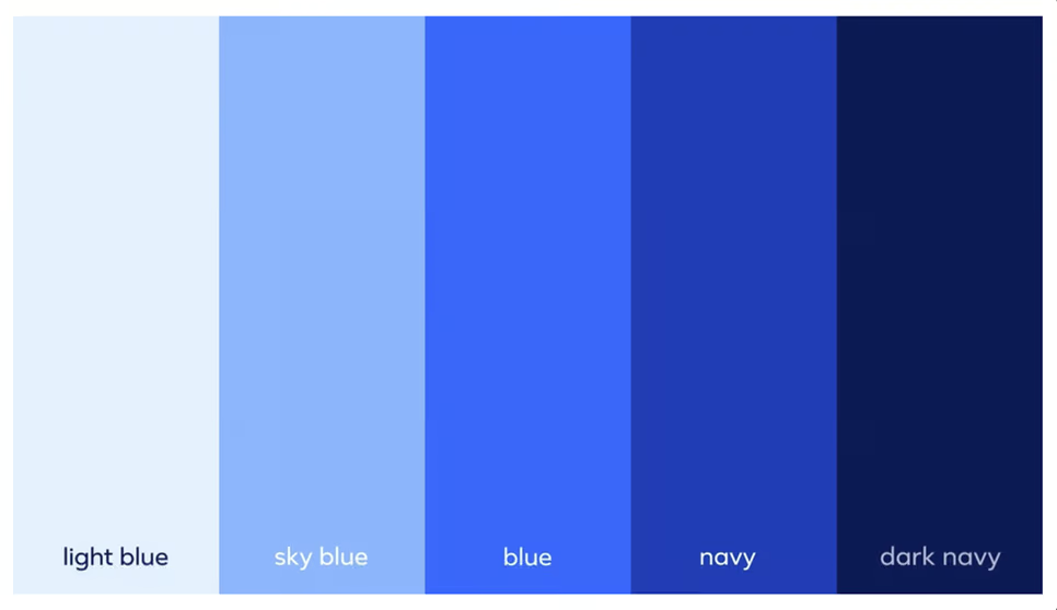
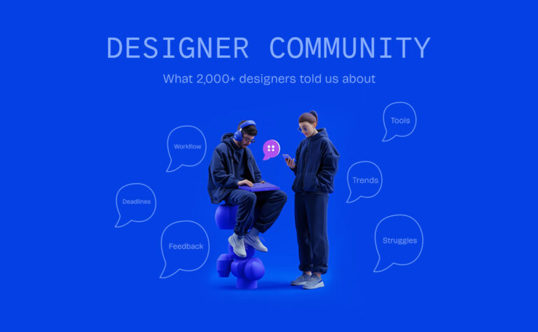
Calmness, trust, and professionalism (used by brands like Facebook and Twitter).
Red
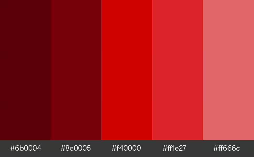
Passion, energy, and urgency (used by brands like Coca-Cola and Target).
Green
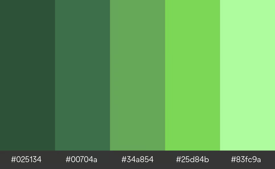
Growth, health, and peace (used by brands like Starbucks and Whole Foods).
By leveraging the emotional triggers of color, designers can craft experiences that connect with users on a deeper level.
The Role of Color in Branding
Color is a cornerstone of branding, often becoming synonymous with a company’s identity. Think of McDonald’s golden arches or Spotify’s vibrant green. These choices are intentional, designed to communicate specific messages:
McDonald’s Red and Yellow
Stimulate hunger and energy.
Spotify’s Green
Reflects creativity and innovation.
Choosing the right color for your brand is crucial because it shapes how people perceive, remember, and interact with your business.
Color in UI/UX Design
In UI/UX design, color serves both aesthetic and functional purposes. The right color contrast can:
Make Buttons Stand Out
Improve navigation and usability.
Enhance Accessibility
Ensure designs are inclusive for users with visual impairments.
Designers must ensure their color choices meet accessibility standards, such as WCAG (Web Content Accessibility Guidelines).
Cultural Differences in Color Perception
Color psychology isn’t universal—it varies across cultures. For example:
White
Symbolizes purity in Western cultures but signifies mourning in some Eastern cultures.
Red
Represents luck and prosperity in China but can signal danger in Western contexts.
For global brands, understanding these cultural nuances is essential to avoid miscommunication and connect with diverse audiences.
How to Choose the Right Colors for Your Design Project
Selecting the perfect color palette starts with understanding your audience and your brand’s message. Here are some tips:
Define Your Brand Values
Are you aiming for trust and professionalism or excitement and energy?
Use Online Tools
Platforms like Adobe Color and Coolors can help you create harmonious color schemes.
Test Your Colors
Ensure your palette works across devices and is accessible to all users.
Conclusion
Color is more than just a design element—it’s a psychological tool that shapes how users perceive and interact with your work. By choosing colors that evoke the right emotions, reflect your brand’s values, and prioritize user experience, you can create designs that are not only visually stunning but also deeply impactful.
Looking for more design tips and tools? Subscribe to our blog and stay updated on the latest trends in the design world!