
This “deceptive” phenomenon can be observed everywhere; it is one of the powerful techniques of visual design, from the logos we encounter daily to complex, intricate designs. These clever tweaks to the visual metaphor push the limits of physics, making us see, feel, or think things that aren’t technically there. Designers rely on optical illusions to engage audiences, provoke discussion, and create unforgettable experiences.
If you’re curious about how designers create these optical illusions or need inspiration for your own projects, this article is for you. We’ll showcase 10 mind-bending examples of optical illusions in design, explain how they work, and highlight their role in both everyday visuals and sophisticated branding strategies.
What Are Optical Illusions in Design?
An optical illusion is a visual phenomenon that disrupts how your brain interprets images. Designers manipulate light, shapes, colors, depth, and patterns to create visuals that defy perception. In design, they fascinate, intrigue, and occasionally challenge the viewer—on purpose.
Optical illusions aren’t just for entertainment. They can:
- Boost Branding: Make visual identifiers unforgettable.
- Guide Focus: Steer users’ attention within a layout.
- Add Depth: Introduce 3D effects to otherwise flat designs.
Now, let’s explore 10 optical illusions in design that mesmerize us.
1. Ambiguous Shapes

Unspecified forms change based on perspective. Consider the classic “faces or a vase” illusion. Designers love this trick because it keeps the viewer engaged longer.
Example: FedEx’s logo cleverly uses negative space to reveal a hidden arrow.
Application Tip: Use ambiguous shapes in branding to create designs that are both subtle and thought-provoking.
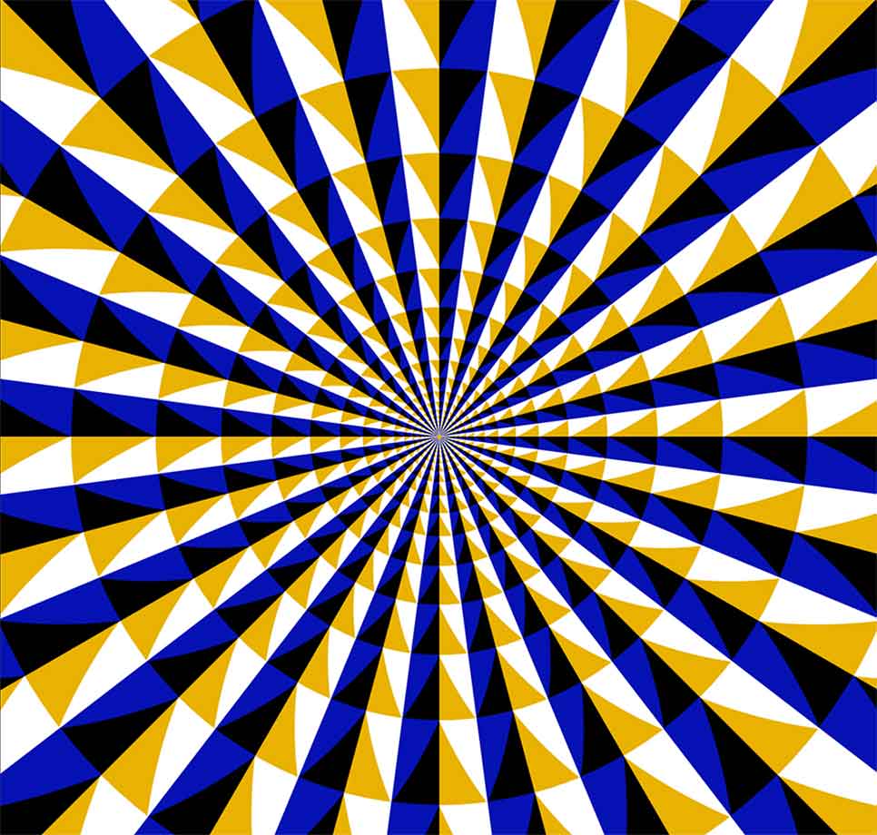
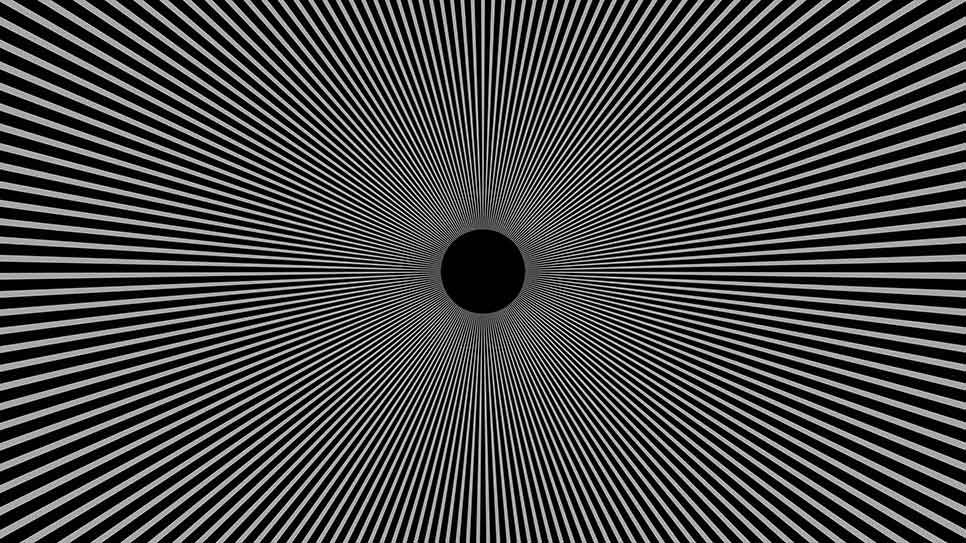
2. Moiré Patterns
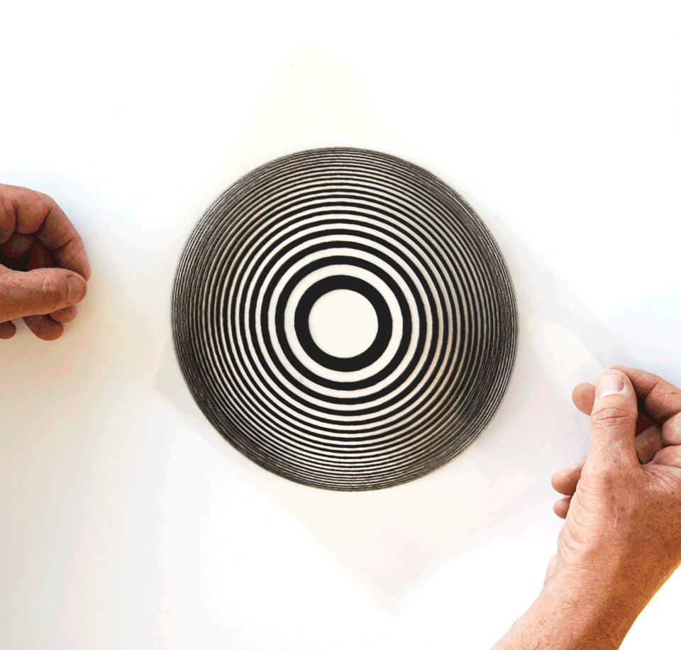
Image by : exploratorium
Moiré patterns arise when two grids overlap at different angles, producing a wave-like effect, suggesting motion even in static designs.
Example: Digital posters and animated graphics often employ moiré patterns for an edgy, energetic feel.
Application Tip: Perfect for brands targeting younger, tech-savvy audiences who appreciate bold visuals.
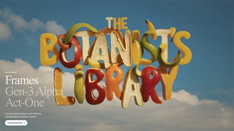
3. 3D Typography
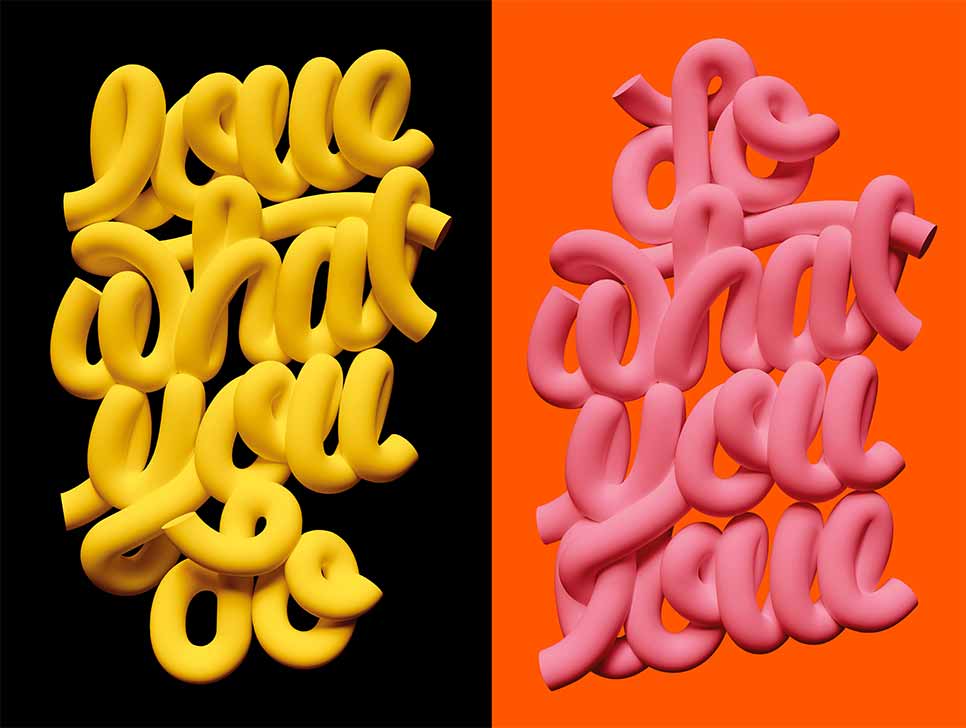
Flat letters are transformed into striking 3D shapes using clever shading and perspective, making them pop.
Example: “Super Mario Odyssey” uses faux 3D text to create depth and playfulness.
Application Tip: Use 3D typography in banners or headings to make designs stand out without overcomplicating them.
4. Impossible Objects
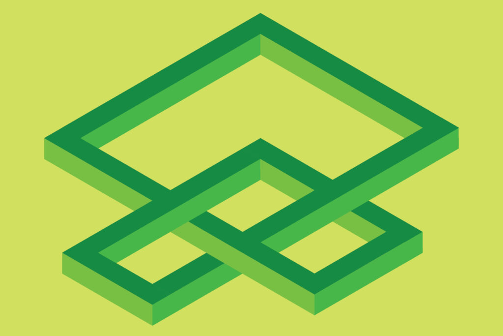
Check out more from Cristina Corobleanu
These designs defy physics and geometry, like the Penrose Triangle or Escher’s “Relativity.”
Example: Escher’s artworks inspire modern packaging and industrial designs.
Application Tip: Ideal for brands that want to emphasize creativity and “thinking outside the box.”
5. Forced Perspective
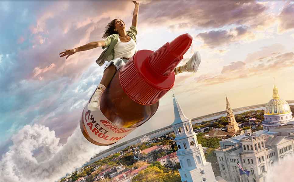
Forced perspective manipulates scale and angles, making images appear vastly different from different viewpoints.
Example: Movie posters and platforms like Airbnb use it for immersive storytelling.
Application Tip: Use forced perspective to add drama or highlight a specific product.
6. Color Contrasts
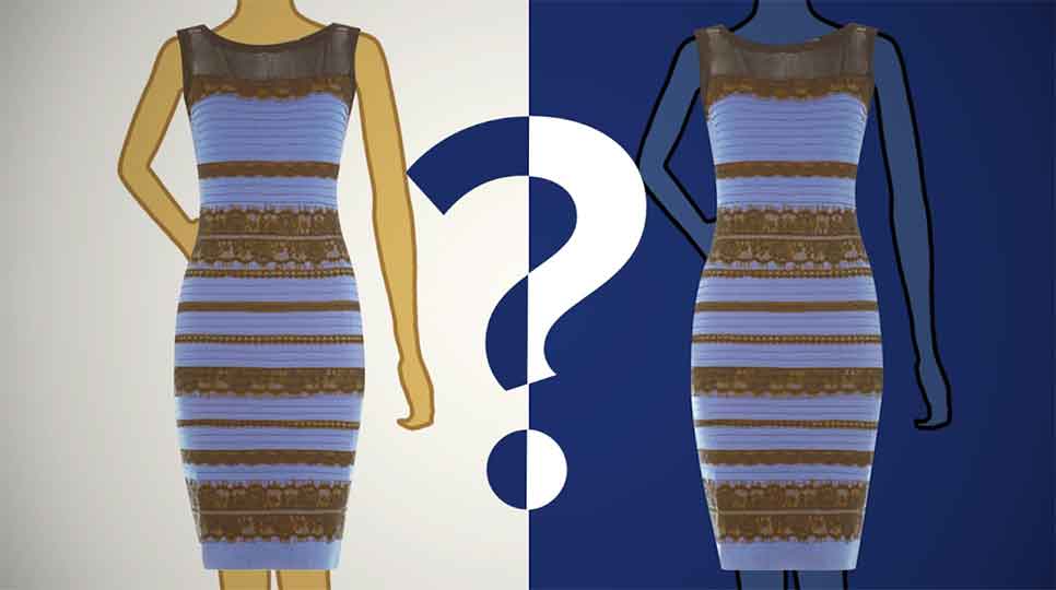
Our brains perceive colors differently based on surrounding hues, creating illusions that alter appearance.
Example: The “blue dress or gold dress” viral phenomenon showcased this perceptual shift.
Application Tip: Pair with modern color psychology to evoke strong emotions in marketing campaigns.
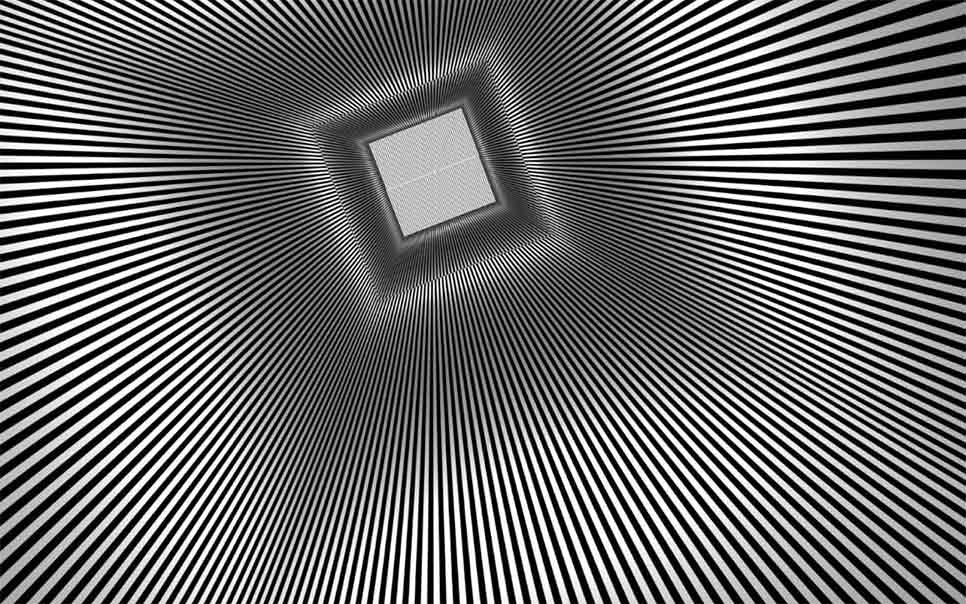
7. Motion Illusions
Static images appear to move due to repetitive patterns, high contrasts, or clever geometry.
Example:
Campaigns like Spotify’s yearly wrap-ups use motion illusions to create dynamic, shareable content.
Application Tip:
Utilise motion illusions to enhance the engagement of posters, websites, or social content.
8. Hidden Images
Designs reveal a secondary image or hidden message when observed closely.
Example: Wendy’s logo subtly spells “MOM” in the ruffles of the collar.
Application Tip: Use hidden images in logos to add emotional depth.
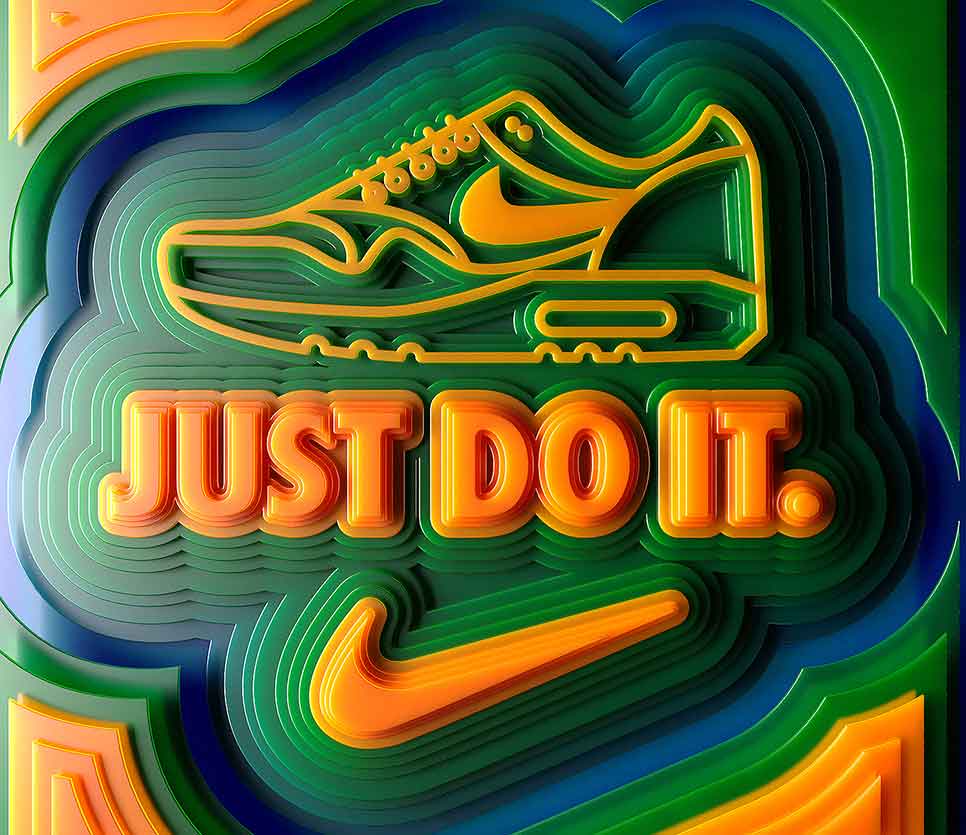
9. Depth Illusion
Shading, layering, and gradients give flat images a 3D effect.
Example: Apple uses depth illusions in marketing to make product displays feel interactive.
Application Tip: Implement depth illusions in UIs to create a tactile, engaging experience.
10. Negative Space Design
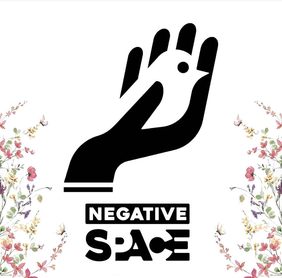
Negative space isn’t empty; it highlights hidden visuals by contrasting background and foreground.
Example: NBC’s peacock logo uses negative space to reveal its iconic symbol.
Application Tip: Use negative space for logos, ads, and product labels to deliver a layered, standout message.
Why Use Optical Illusions in Design?
Optical illusions are more than eye-catching visuals. They:
- Engage: Captivate audiences and encourage shares.
- Create Memorability: Designs that defy expectations are hard to forget.
- Boost Branding: Showcase innovation and creativity.
- Strengthen Messaging: Quietly support your brand values and stories.
Incorporating optical illusions into branding, websites, and ads helps you captivate your audience and differentiate your work.
How to Master Optical Illusions in Your Designs
- Experiment with Tools: Use Adobe Photoshop, Illustrator, and other design software.
- Start Simple: Begin with basic illusions like negative space or 3D typography.
- Study Inspirations: Analyze iconic branding assets like the FedEx logo.
- Add Depth With Data: Create dynamic infographics that cleverly exploit perception.
Frequently Asked Questions
Can I use optical illusions for any type of business? Yes! Optical illusions enhance storytelling across tech, retail, and creative industries.
Do illusions work for digital platforms? Absolutely! They’re perfect for social media, websites, and mobile apps.
Can optical illusions confuse users? Only if poorly executed. Balance creativity with clarity, especially for UIs or navigations.
Where to Learn More
Loved this post? Check out The Power of Color Psychology in Design to see how colors influence perception just like illusions do.
hi!,I love your writing so much! proportion we communicate more abbout yoiur post on AOL?
I requuire an expert in this space to resolve my problem.
Maybe that’syou! Looking ahead to peer you.
Thank you! Do you have a website or project link so I can understand your requirement better?